In March 2024, a group exhibition will open at Galleria Kuvitus, featuring a rarely-exhibited form of illustration: product packaging.
The idea for the group exhibition came from Piia Keto who has worked for clients such as Elovena and Fazer. Keto found a number of other packaging designers for her exhibition application, and the resulting exhibition will showcase the work of 20 illustrators.
“Galleria Kuvitus exhibits illustrations in various contexts and we showcase client-commissioned illustrations in addition to independent projects. It’s great to be able to display packaging designed by several artists side by side,” says Veera Pekkinen, the curator of the gallery.
A survey conducted by the Finnish Illustration Association in 2023 revealed that about one in three illustrators create packaging illustrations. The number of illustrations commissioned by the food industry has grown slightly from the previous year.
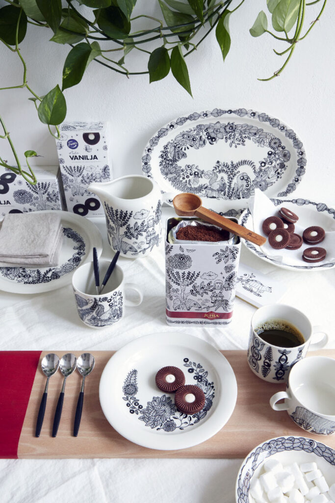

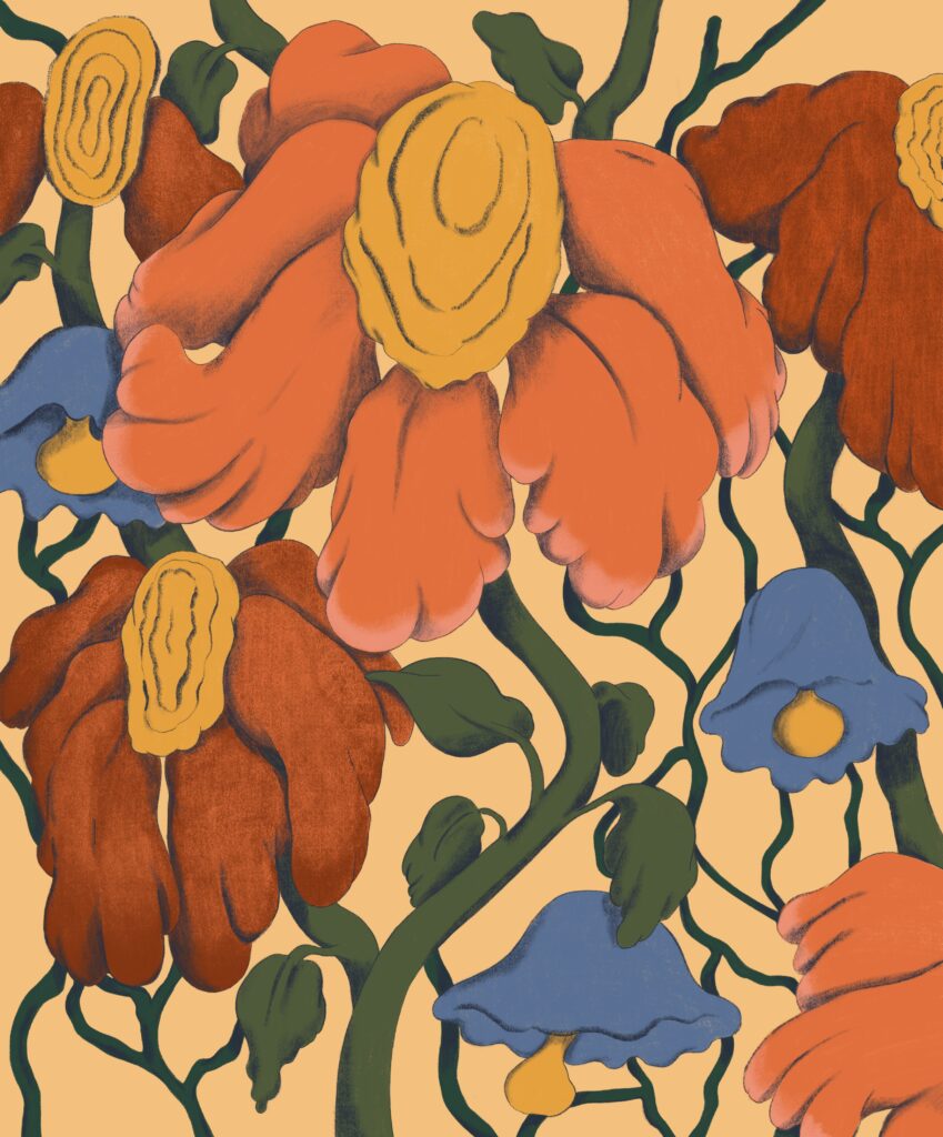
One of the exhibited illustrators is Janine Rewell, represented by Agent Pekka, whose fluid vector illustrations have been featured on the products of Arla, Paulig, Kiehl’s and Häagen-Dazs, among others.
Collaboration with American cosmetics brand Kiehl’s got off to a flying start five years ago when the company flew Rewell to a meeting at their New York office. Before being selected for the project, Rewell, together with several other illustrators, had been asked to submit a proposal for Christmas packaging illustrations in return for a fee.
“The collaboration project was extensive and included illustrations for about 70 product packages. The visuals were also used in marketing and shops,” says Rewell.
Rewell was also responsible for the graphic design of the packaging for the Kiehl’s project, and she wanted to use typefaces designed by Finnish designers Schick & Toikka and Emil Bertell.
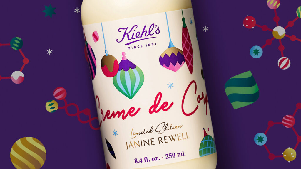

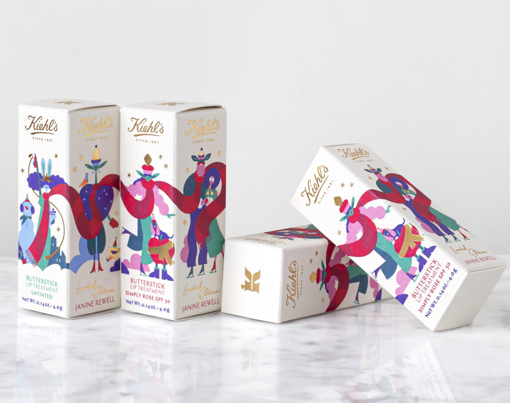

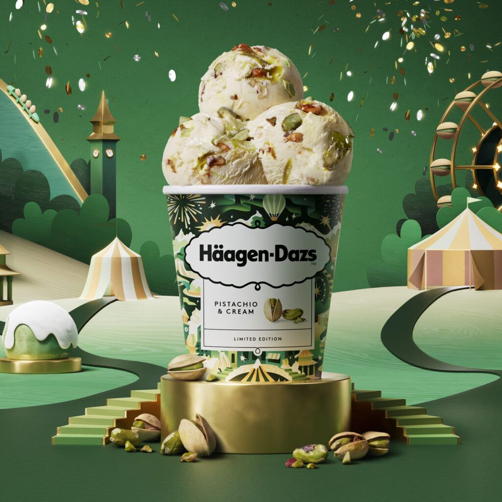
Rewell has also created four packaging designs for another American client, the ice cream brand Häagen-Dazs. The project also involved British marketing agency Love Creative.
“The first packaging designs I created for Häagen-Dazs were simpler, and the illustrations focused on creating associations between the design and the flavour. The last design was more detailed and complex, because the idea was that the illustration would also convey the atmosphere of the winter season and tell a story,” says Rewell.
In addition to packaging, Rewell’s illustrations were used in 3D-animated advertising videos.
Rewell has been impressed with the expertise of the artistic management at Love Creative. On top of everything else, their well-thought-out brief included a story of a winter wonderland, its creamy clouds, the smell of pistachio and nut trees.
“The story helped me get into the right mindset.”
Rewell says that vague instructions can often lead to multiple editing rounds. With commercial projects, it is often easier if the client already has an idea of what they want.
“Although the client immediately felt like the illustration hit the spot, many details still needed some fine-tuning. One of the key things was to make sure that the elements designed for the Asian market would also work in other market areas. I worked on two illustrations almost full-time for three months,” says Rewell.

Packaging illustrations are highly consumer-oriented. Rewell has learned that people tend to like different things in shops than they do in other settings. Especially food packaging needs to communicate flavour according to the client’s wishes.
“As a designer, I would love to create calm, minimalist packaging, but vivid colours and striking elements are the things that catch people’s eye in the shop.”
Packaging projects often involve a marketing agency working between the illustrator and the client. In the past few years, SEK has been responsible for the packaging design of brands like Kesko, Fazer, Valio and Paulig. Creative Director Sebastian Hurmerinta leads a design team of about 20 people at the agency.
“We can produce individual illustrations with our in-house team, but I’d say that over 70 per cent of our illustrations are commissioned from outside the agency,” says Hurmerinta.
How do you choose the illustrators?
“We have excellent agencies in Finland and we often turn to them, and naturally we also use the portfolio pages of the Finnish Illustration Association. Many of our team members also provide suggestions of suitable illustrators ‒ it’s part of our job to keep track of the industry,” says Hurmerinta.
When designing packaging, you first need to define what kind of brand and product you are working with and what message you want the packaging to convey. Who is the product aimed at, and who should the design appeal to?
“The right illustration style supports all this. Illustrations provide a great way to stand out from the competition, appeal to different target groups or separate product lines from each other.”
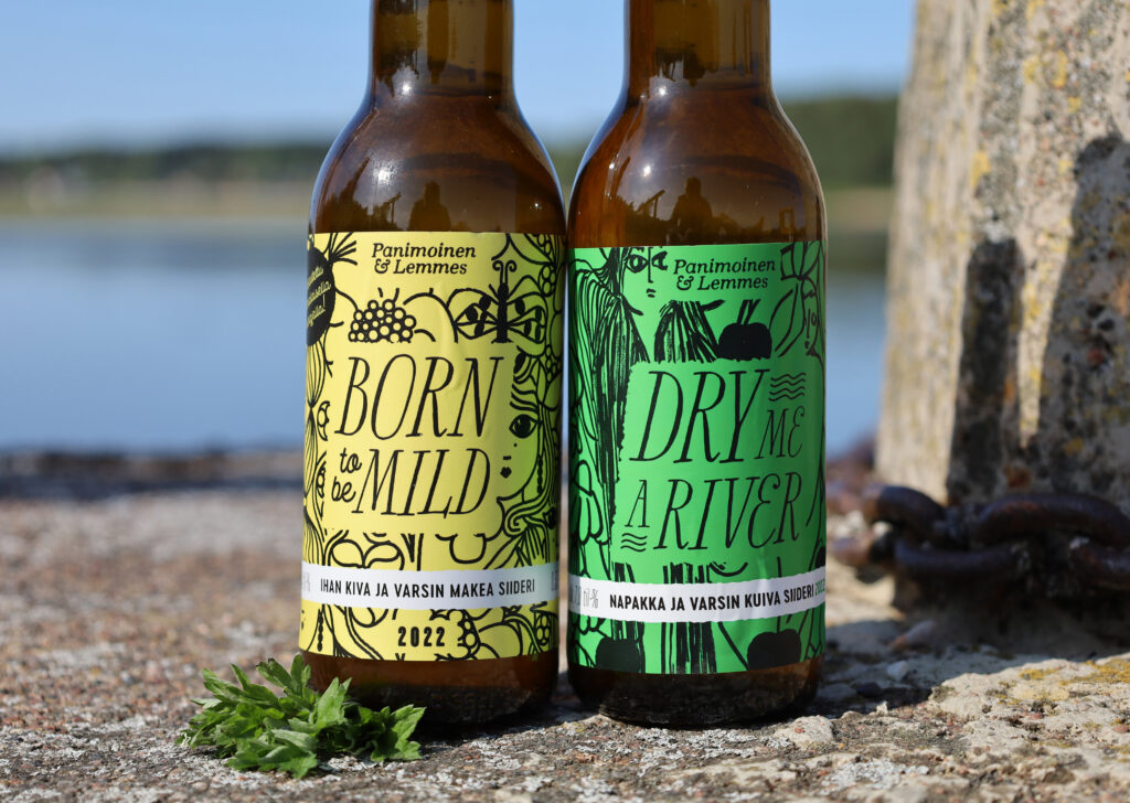

Hurmerinta explains that packaging design also influences price perception. Do you want to convey luxury or perhaps emphasize affordability?
“Even though consumers can see the price right next to the product, their subconscious impressions have a strong influence on buying behaviour. You would never think that you can make a product look too expensive, but that is quite possible ‒ and vice versa as well.”
The most affordable products often have a simpler design. However, Hurmerinta emphasizes that the quality of packaging design should be high even when it communicates affordability.
After planning the product identity and the packaging concept, the agency creates initial drafts that are sent to the client for approval. After this, they choose an illustrator and do a test round. After the finished illustrations have been delivered, they usually undergo several rounds of editing before all parties are satisfied with the final result.
“Projects involve people from both the client’s and the design agency’s organization, so naturally, there are many different opinions. The work needs to be done in stages with discussions in between. Patience and flexibility are useful traits for an illustrator.”
Fine-tuning may also continue in the production stage in terms of colour correction and other technical details. Designers rarely get to influence the shape of the packaging itself, because manufacturing packaging that differs from the standard designs is expensive.
Packaging illustration projects typically involve a lot of work, but this is also reflected in the fees charged. In a survey by The Finnish Illustration Association, illustrators who create packaging illustrations stood out from the rest due to their higher annual turnover, and they also felt that the illustration fees were more reasonable in relation to the amount of work than those working for clients in many other industries. As with other commissioned illustrations, the rates depend not only on the amount of work, but also on the scope of the illustration license.
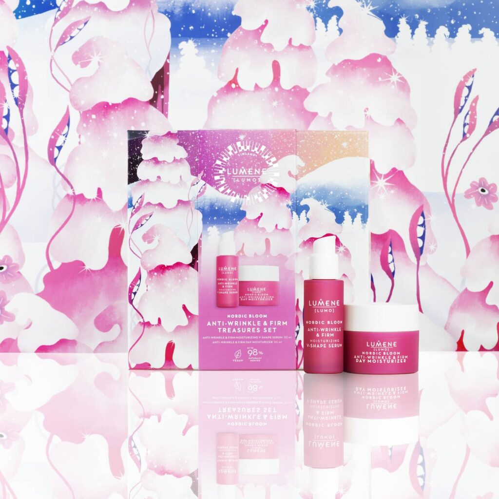

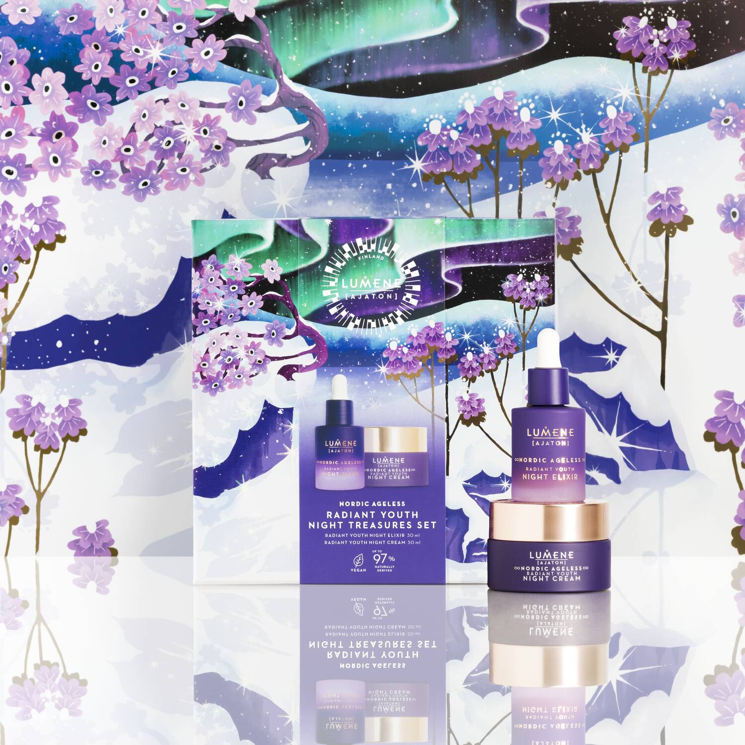
Represented by Napa Agency, Jenna Kunnas designed winter season campaign illustrations for the Christmas gift sets of Lumene the year before last. The collaboration was organized through the agency directly with the management of the Lumene design team without a separate design agency.
“Lumene sent me a thorough brief describing the mood they wanted the illustrations to convey. They wanted to avoid imagery associated exclusively with Christmas, and instead portray winter nature and the northern light,” says Kunnas.
In addition, the gift sets had to match the signature colours of the product lines.
“But I did get to choose the other colours in the palette alongside the main colours,” says Kunnas.
In addition to the brief, Kunnas received a template from the company’s design team that gave her an idea of what the package looks like as a whole and where the texts should go.
There was a lot to design: a beauty advent calendar with 24 compartments and six different cosmetic gift sets. Kunnas created two different drafts of the entire line. After the final design was selected, the work progressed smoothly and calmly. The client’s wishes required only minor tweaks to the design.
Kunnas says that she was delighted that the cosmetics brand wanted to give special attention to the printing and made sure that the gold foil drops suggested by the illustrator were included in the packaging.
“It was great to see not only the packaging in shops, but also the cardboard stands and floor tape designs created from my illustrations. When I took photographs of them for my personal archives, a salesperson came and tried to sell me the products, saying how delightful the new visual image of the brand was,” says Kunnas.
In addition to Kunnas, others who have created packaging illustrations for Lumene include Satu Kettunen and Anna Emilia Laitinen.


Another packaging illustration project that Jenna Kunnas has particularly enjoyed has been her eight-year collaboration with the Finnish-owned Carsin winery in Bordeaux.
“It has been a really pleasant and rewarding collaboration in which the client has had strong faith in the illustrator’s own vision,” says Kunnas.
Since the winery is biodynamic, its wine labels are also inspired by nature. Kunnas has asked them questions concerning the environment where the grapes grow and even the kinds of insects that buzz around the region.
“I first designed labels for the subsidiary of the company and, after the transfer of the company to the next generation, I have also renewed some of the more conservative labels of the main product line in my style.”
Janine Rewell says that she has recently been thinking even more about the designer’s responsibility. What kind of companies can you collaborate with while staying true to your personal values?
“Buying a product as an individual consumer is different than designing the product itself, because an attractive design can have a major impact on sales.”
Sebastian Hurmerinta confirms that when it comes to product sales, packaging plays a huge role. Whenever packaging is renewed, the change is always motivated by business goals as well.
Package Stories
Galleria Kuvitus
22 March – 21 April 2024

