
Jukka Piira
Hi! I'm Helsinki-based creative, talented, fast and flexible graphic designer, illustrator and layout artist. I have a narrative approach to my illustrations to give them life beyond ordinary commissioned work; even if there is only one image, there still is a whole story behind it.
I have an uncanny skill to quickly visualize any given subject and then turn it into a traditional or digital illustration, or a combination of them. Adobe Creative Cloud, especially Illustrator, InDesign, Photoshop ja Fresco, bend easily into my will. Even though I prefer working by hand, a pen display with a pressure sensitive pen is a great pair to meet tighter schedules.
Helsinki city, Helsinki Social and Health Services' work-based activities, Helsinki Media, and private customers. "Your illustrations are way better than what you usually see in magazines", one of my colleagues put it.
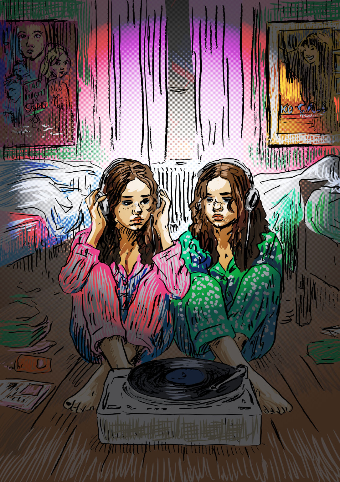
The Sound of **** / cover illustration for a customer magazine
I got to choose which article my cover illustration would represent, and I chose a report of a record fair. A nasty title comes from a bad day in the office, which I wanted to contrast with a gentle illustration. A combination of pencil drawing and vector graphics.
The Sound of **** / cover illustration for a customer magazine
Click to see more about the project.
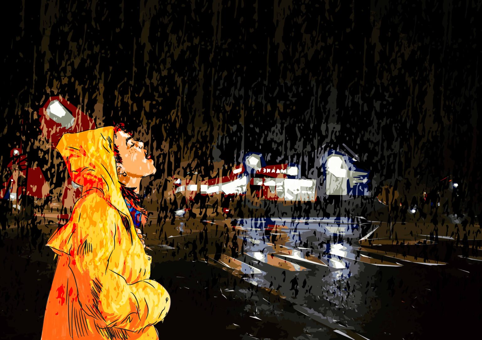
The Taste of Fall / Magazine illustration
The article in question was about fall weather. Since the author of the article knew me well, she gave me free hands to approach the illustration, which is vector graphics in three parts; a figure drawn with a display pen, a backdrop of photo turned into vectors, and the rain isolated from a photo and turned also into vectors.
The Taste of Fall / Magazine illustration
Click to see more about the project.
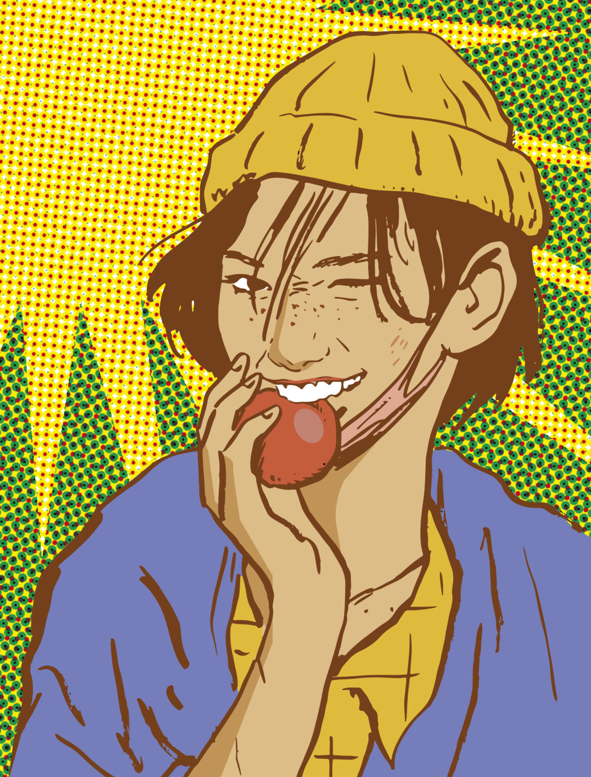
Jonna / cover illustration for a customer magazine
The issue in question was about harvest time. Originally, there was to be some generic autumn photograph on the cover, but I dared suggest my illustration instead, a pencil drawing finished with vector graphics. ”I think it’s great”, said the boss. Face mask tells that the image was done during Covid-19 pandemic.
Jonna / cover illustration for a customer magazine
Click to see more about the project.
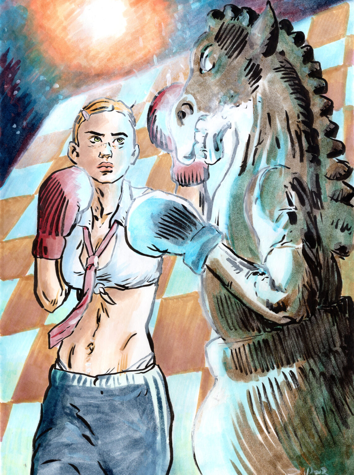
Checkmate! / magazine illustration
The article in question featured rarer chess variations, one of which is boxing chess; in turns bouts in the ring and games of chess by the table. My boxer is a fiery young woman instead of typical musclebound pugilist. The final artwork is hand-drawn piece, filling a single page vertically. Before it, though, I tried horizontal version, which I first sketched digitally with Android tablet. I disgarded the horizontal illustration due to layout reasons.
Checkmate! / magazine illustration
Click to see more about the project.
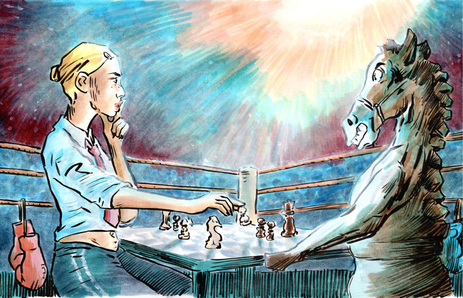
Checkmate! / magazine illustration
The article in question featured rarer chess variations, one of which is boxing chess; in turns bouts in the ring and games of chess by the table. My boxer is a fiery young woman instead of typical musclebound pugilist. The final artwork is hand-drawn piece, filling a single page vertically. Before it, though, I tried horizontal version, which I first sketched digitally with Android tablet. I disgarded the horizontal illustration due to layout reasons.
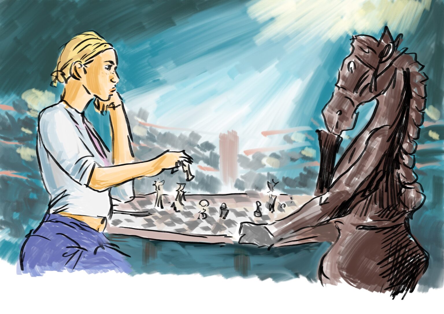
Checkmate! / magazine illustration
The article in question featured rarer chess variations, one of which is boxing chess; in turns bouts in the ring and games of chess by the table. My boxer is a fiery young woman instead of typical musclebound pugilist. The final artwork is hand-drawn piece, filling a single page vertically. Before it, though, I tried horizontal version, which I first sketched digitally with Android tablet. I disgarded the horizontal illustration due to layout reasons.
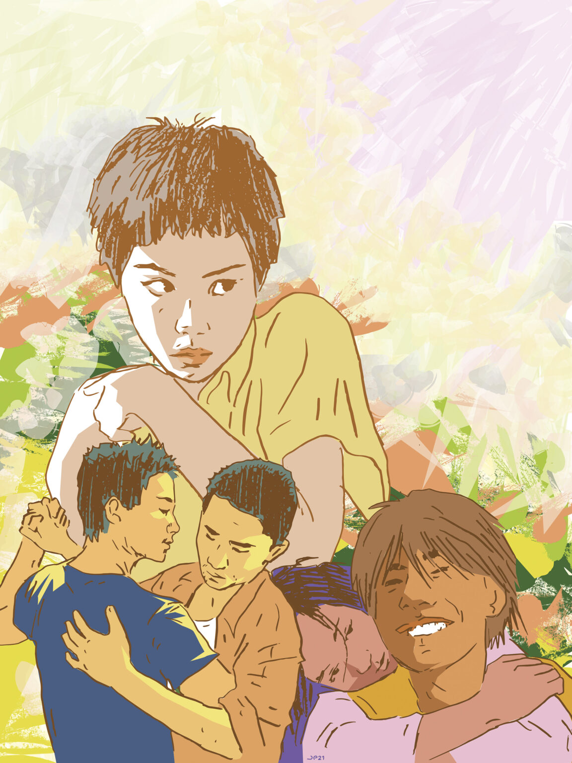
Wong Kar-Wai pastiches / magazine illustration
I drew these two images for an article about Wong Kar-Wai’s movies. The image featuring Chunking Epress, Happy Together and Fallen Angels is a pencil drawing I finished with vector graphics. The second image, featuring In the Mood for Love and 2046, I drew with Android tablet and a drawing software.
Wong Kar-Wai pastiches / magazine illustration
Click to see more about the project.
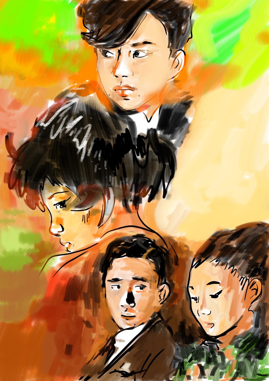
Wong Kar-Wai pastiches / magazine illustration
I drew these two images for an article about Wong Kar-Wai’s movies. The image featuring Chunking Epress, Happy Together and Fallen Angels is a pencil drawing I finished with vector graphics. The second image, featuring In the Mood for Love and 2046, I drew with Android tablet and a drawing software.
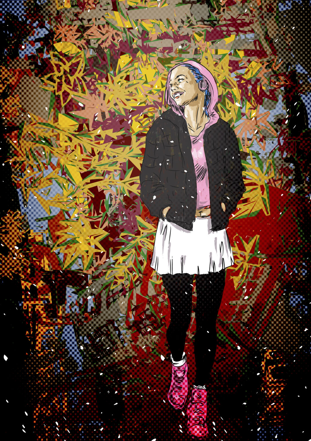
Colorful Day / cover illustration for a customer magazine
Another cover illustration with autumnal theme. Because I like most drawing humans, this, too, is figure-based. Even though fall weather is often cold and wet, the color splendor brings smile to one’s face. The walker is drawn in vectors with a pen display, and the backdrop consists of layers of manipualted photos from own collection.
Colorful Day / cover illustration for a customer magazine
Click to see more about the project.
Random article illustrations
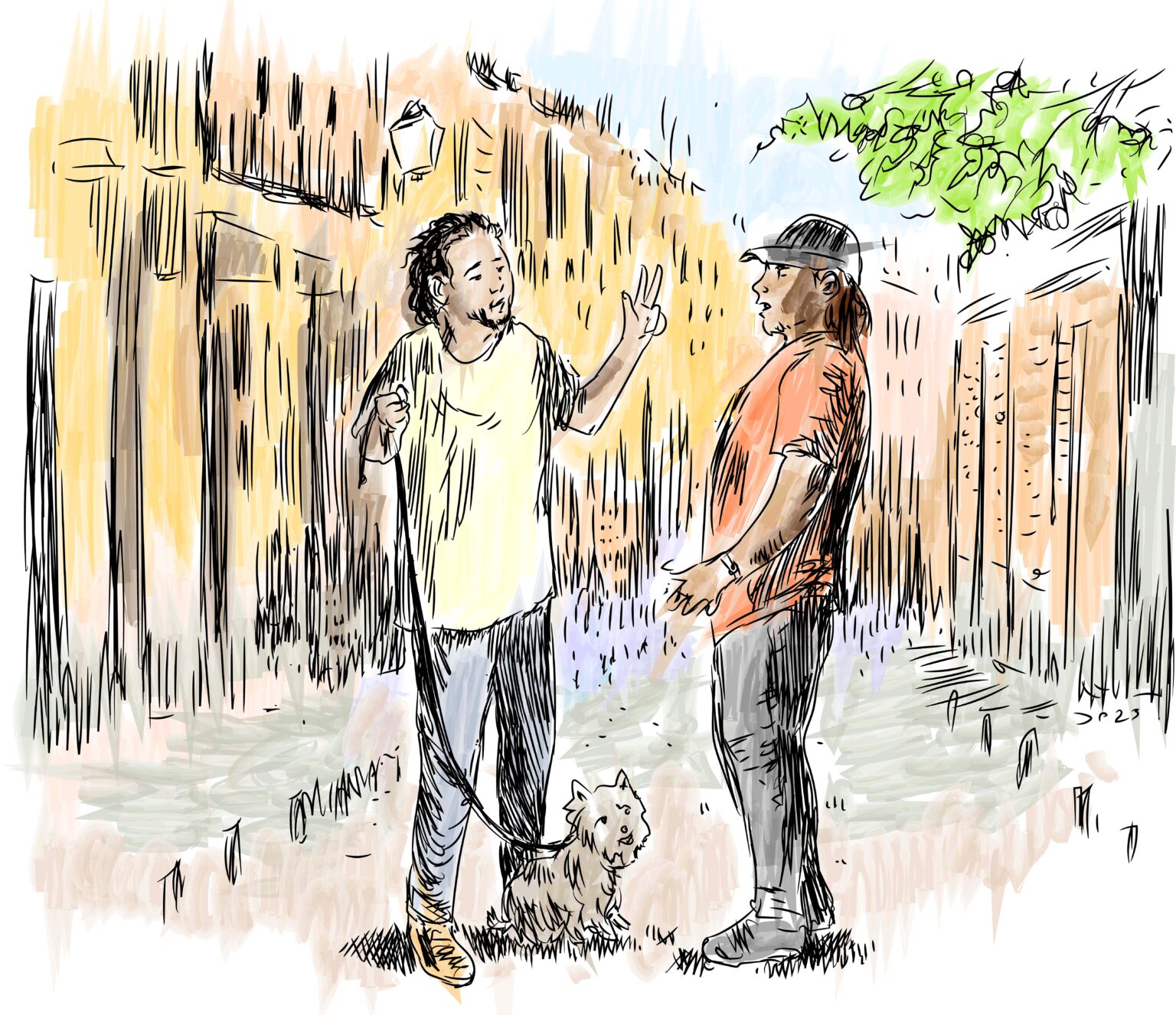
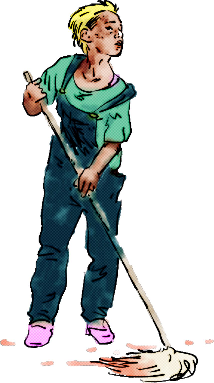
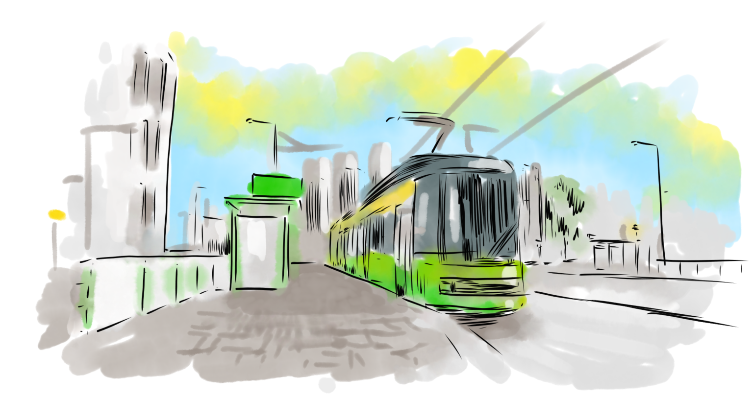
A collection of more or less quick drawings to fill up the layout space and also to support articles.
Random article illustrations
Click to see more about the project.
Random article illustrations
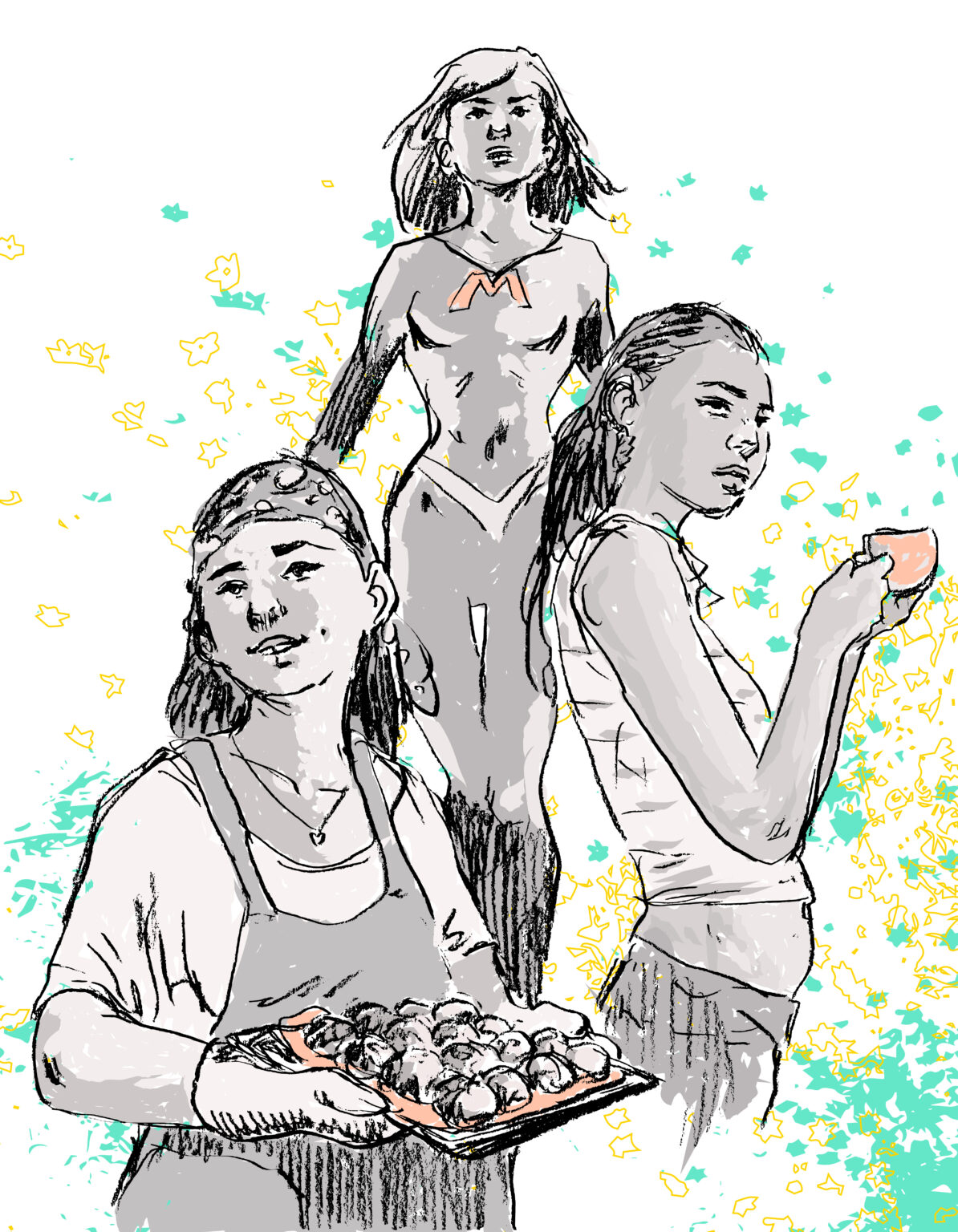
A collection of more or less quick drawings to fill up the layout space and also to support articles.
Random article illustrations
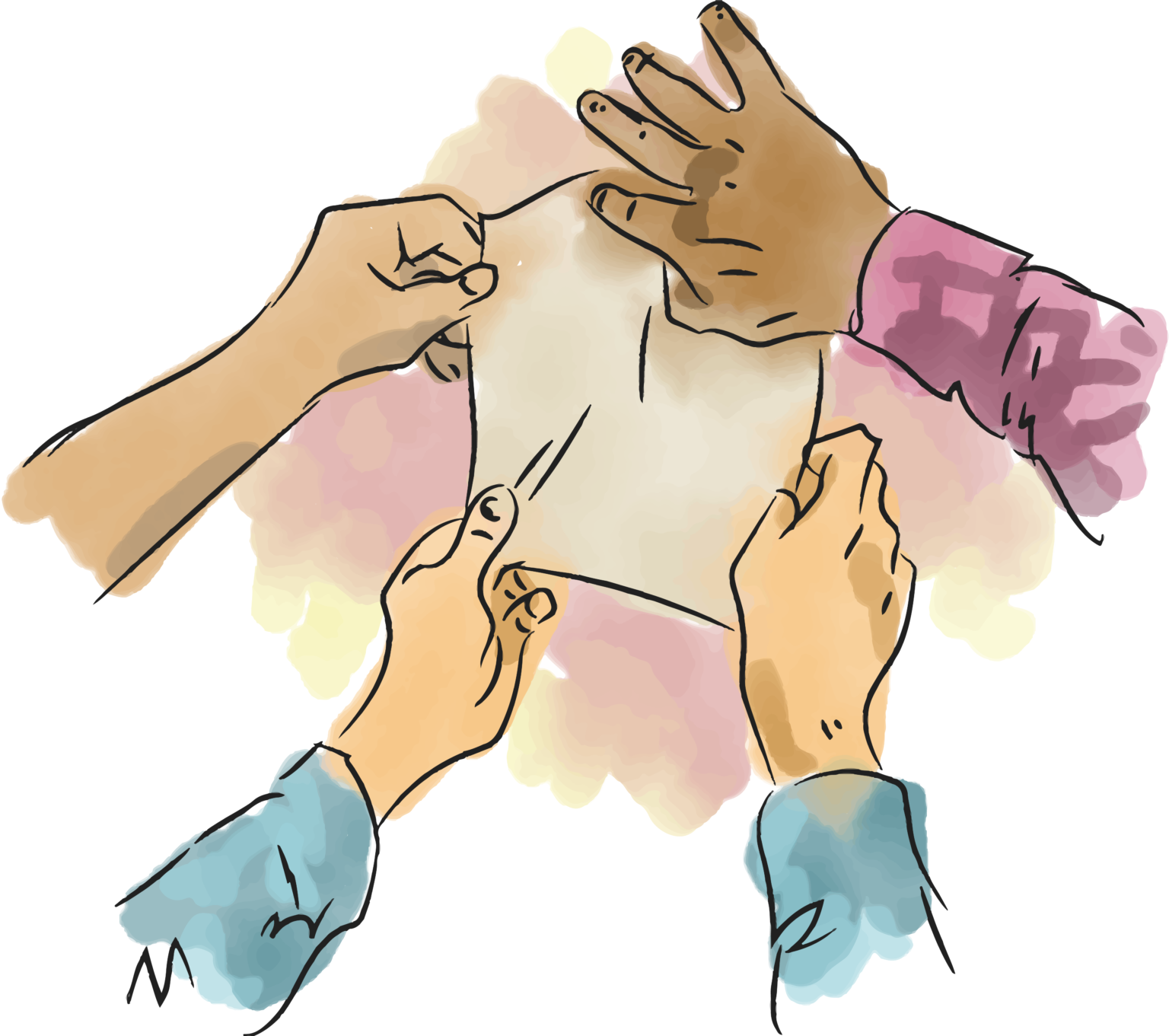
A collection of more or less quick drawings to fill up the layout space and also to support articles.
Random article illustrations
A collection of more or less quick drawings to fill up the layout space and also to support articles.
Random article illustrations
A collection of more or less quick drawings to fill up the layout space and also to support articles.
Romance / a serial story in a magazine
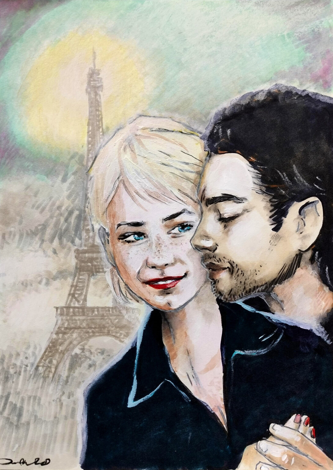
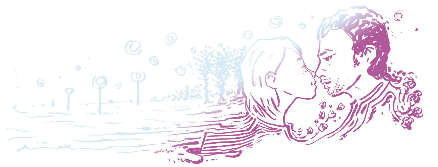
A romantic serial that run through four issues. The idea was that another author picks up from where the previous was left. The participants and the setting of the love stort was set beforhand, eveything else was up to imagination of different authors. I got to illustrate the serial. The first illustration is the cover image of the first part and the fifth illustration cover art of the final chapter. Both illustrations are hand-made. Line drawings between these two were used to liven up other chapters.
Romance / a serial story in a magazine
Click to see more about the project.
Romance / a serial story in a magazine
A romantic serial that run through four issues. The idea was that another author picks up from where the previous was left. The participants and the setting of the love stort was set beforhand, eveything else was up to imagination of different authors. I got to illustrate the serial. The first illustration is the cover image of the first part and the fifth illustration cover art of the final chapter. Both illustrations are hand-made. Line drawings between these two were used to liven up other chapters.
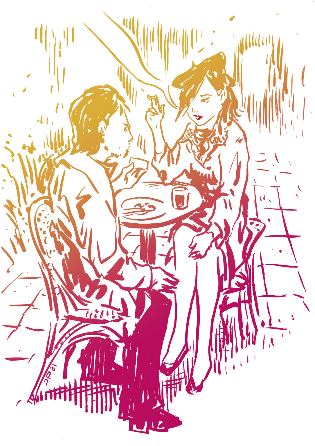
Romance / a serial story in a magazine
A romantic serial that run through four issues. The idea was that another author picks up from where the previous was left. The participants and the setting of the love stort was set beforhand, eveything else was up to imagination of different authors. I got to illustrate the serial. The first illustration is the cover image of the first part and the fifth illustration cover art of the final chapter. Both illustrations are hand-made. Line drawings between these two were used to liven up other chapters.
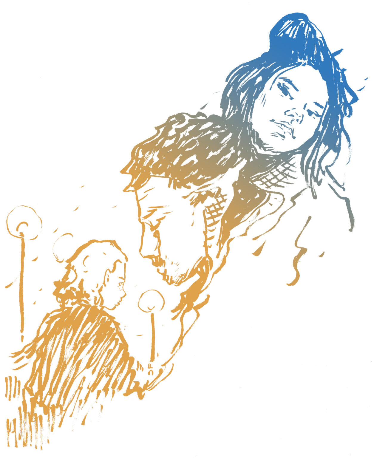
Romance / a serial story in a magazine
A romantic serial that run through four issues. The idea was that another author picks up from where the previous was left. The participants and the setting of the love stort was set beforhand, eveything else was up to imagination of different authors. I got to illustrate the serial. The first illustration is the cover image of the first part and the fifth illustration cover art of the final chapter. Both illustrations are hand-made. Line drawings between these two were used to liven up other chapters.
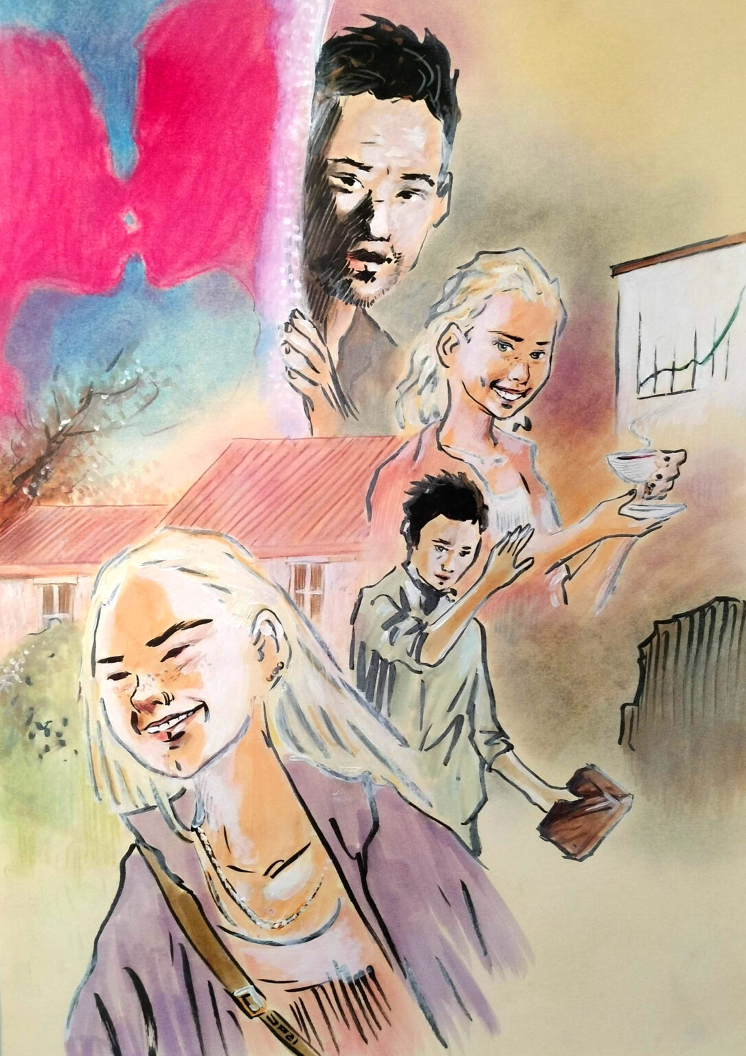
Romance / a serial story in a magazine
A romantic serial that run through four issues. The idea was that another author picks up from where the previous was left. The participants and the setting of the love stort was set beforhand, eveything else was up to imagination of different authors. I got to illustrate the serial. The first illustration is the cover image of the first part and the fifth illustration cover art of the final chapter. Both illustrations are hand-made. Line drawings between these two were used to liven up other chapters.
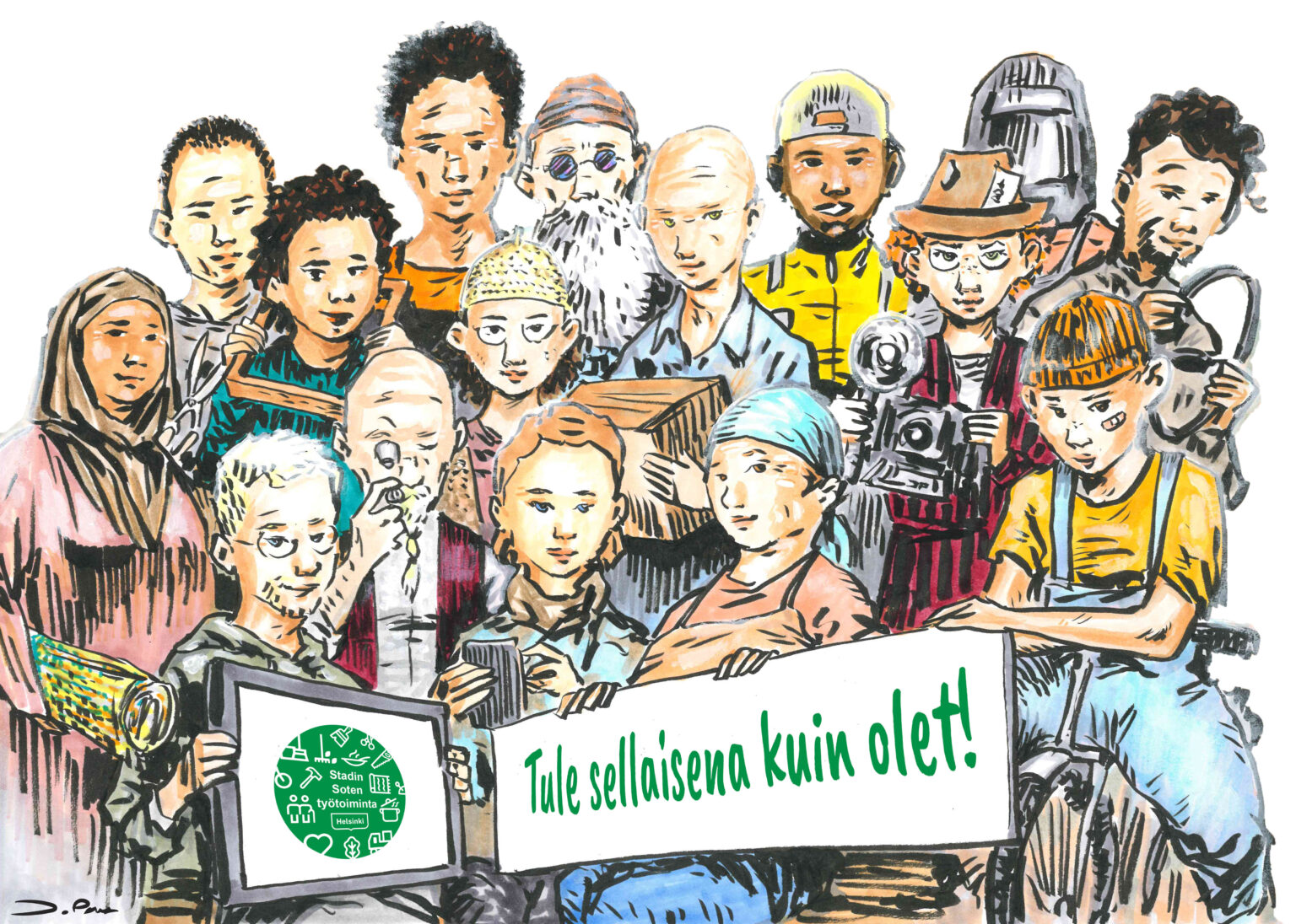
Spot illustrations / Helsinki Social and Health Services' rehabilitative work services
I drew hundred of spot illustrations for Helsinki Social and Health Services’ rehabilitative services to be used in flyers, newsletters, websites and such. What you see here is a mere fraction of the whole. I wanted to keep these spot illustrations sketchy and approachable, and drew most of them with a pen display. “Class photo” and “Celebration” are hand-drawn.
Spot illustrations / Helsinki Social and Health Services' rehabilitative work services
Click to see more about the project.
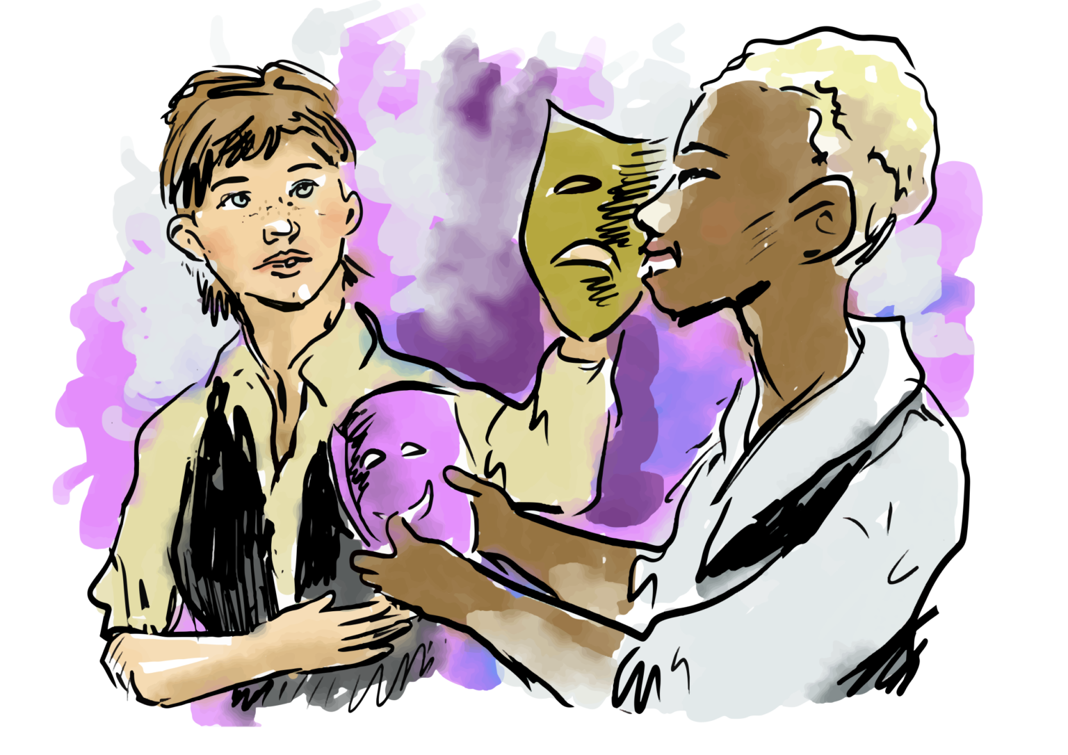
Spot illustrations / Helsinki Social and Health Services' rehabilitative work services
I drew hundred of spot illustrations for Helsinki Social and Health Services’ rehabilitative services to be used in flyers, newsletters, websites and such. What you see here is a mere fraction of the whole. I wanted to keep these spot illustrations sketchy and approachable, and drew most of them with a pen display. “Class photo” and “Celebration” are hand-drawn.
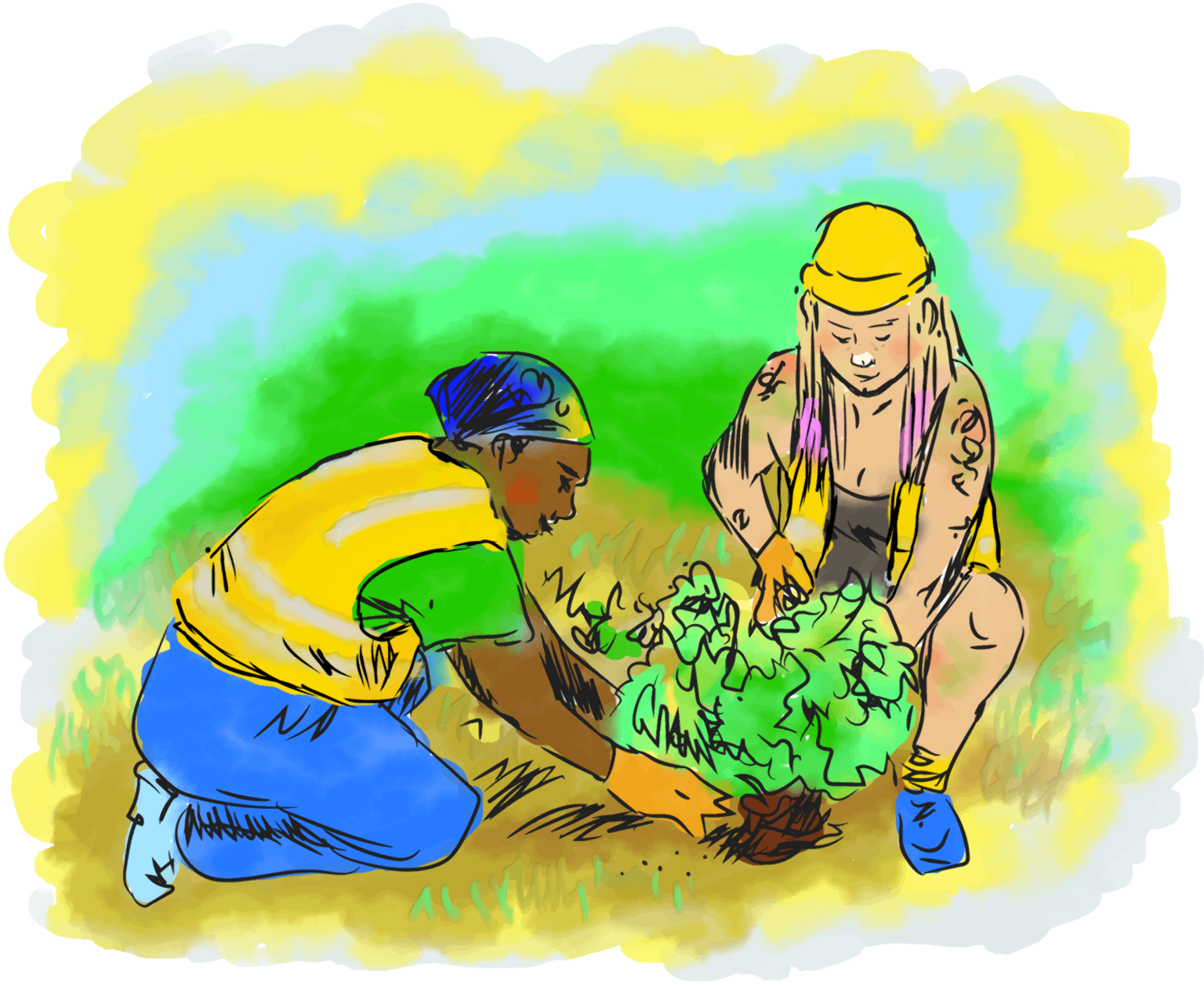
Spot illustrations / Helsinki Social and Health Services' rehabilitative work services
I drew hundred of spot illustrations for Helsinki Social and Health Services’ rehabilitative services to be used in flyers, newsletters, websites and such. What you see here is a mere fraction of the whole. I wanted to keep these spot illustrations sketchy and approachable, and drew most of them with a pen display. “Class photo” and “Celebration” are hand-drawn.
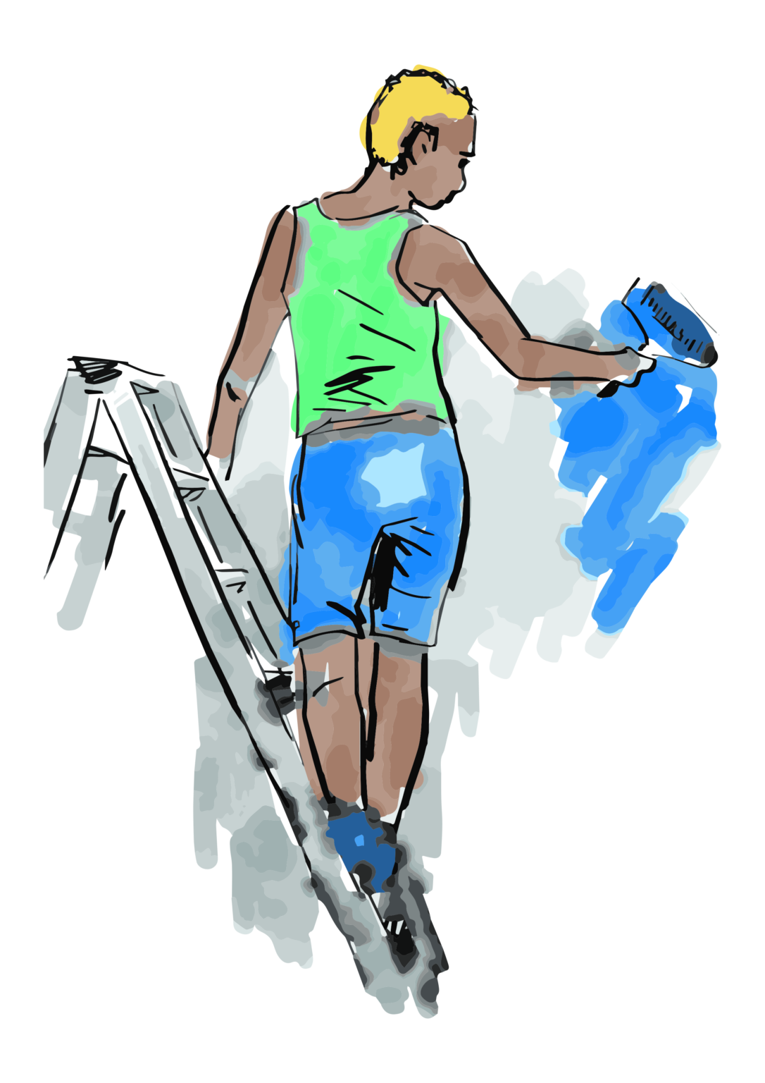
Spot illustrations / Helsinki Social and Health Services' rehabilitative work services
I drew hundred of spot illustrations for Helsinki Social and Health Services’ rehabilitative services to be used in flyers, newsletters, websites and such. What you see here is a mere fraction of the whole. I wanted to keep these spot illustrations sketchy and approachable, and drew most of them with a pen display. “Class photo” and “Celebration” are hand-drawn.
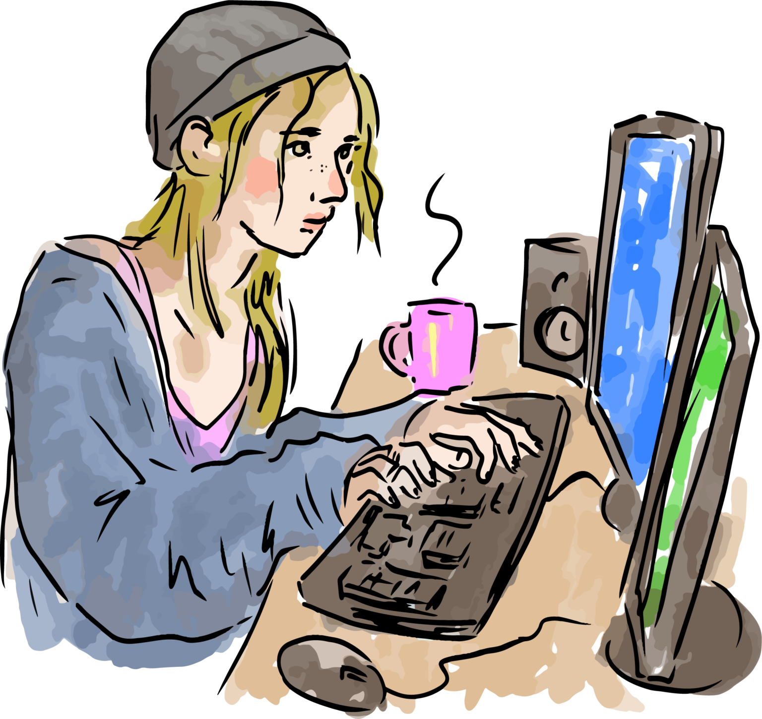
Spot illustrations / Helsinki Social and Health Services' rehabilitative work services
I drew hundred of spot illustrations for Helsinki Social and Health Services’ rehabilitative services to be used in flyers, newsletters, websites and such. What you see here is a mere fraction of the whole. I wanted to keep these spot illustrations sketchy and approachable, and drew most of them with a pen display. “Class photo” and “Celebration” are hand-drawn.
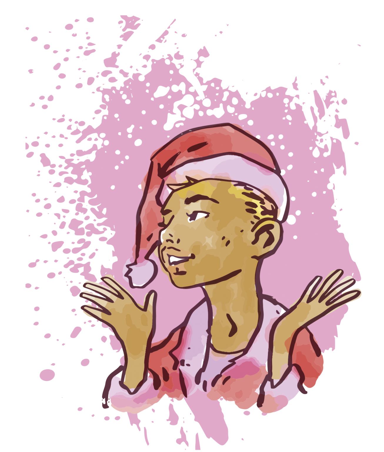
Spot illustrations / Helsinki Social and Health Services' rehabilitative work services
I drew hundred of spot illustrations for Helsinki Social and Health Services’ rehabilitative services to be used in flyers, newsletters, websites and such. What you see here is a mere fraction of the whole. I wanted to keep these spot illustrations sketchy and approachable, and drew most of them with a pen display. “Class photo” and “Celebration” are hand-drawn.
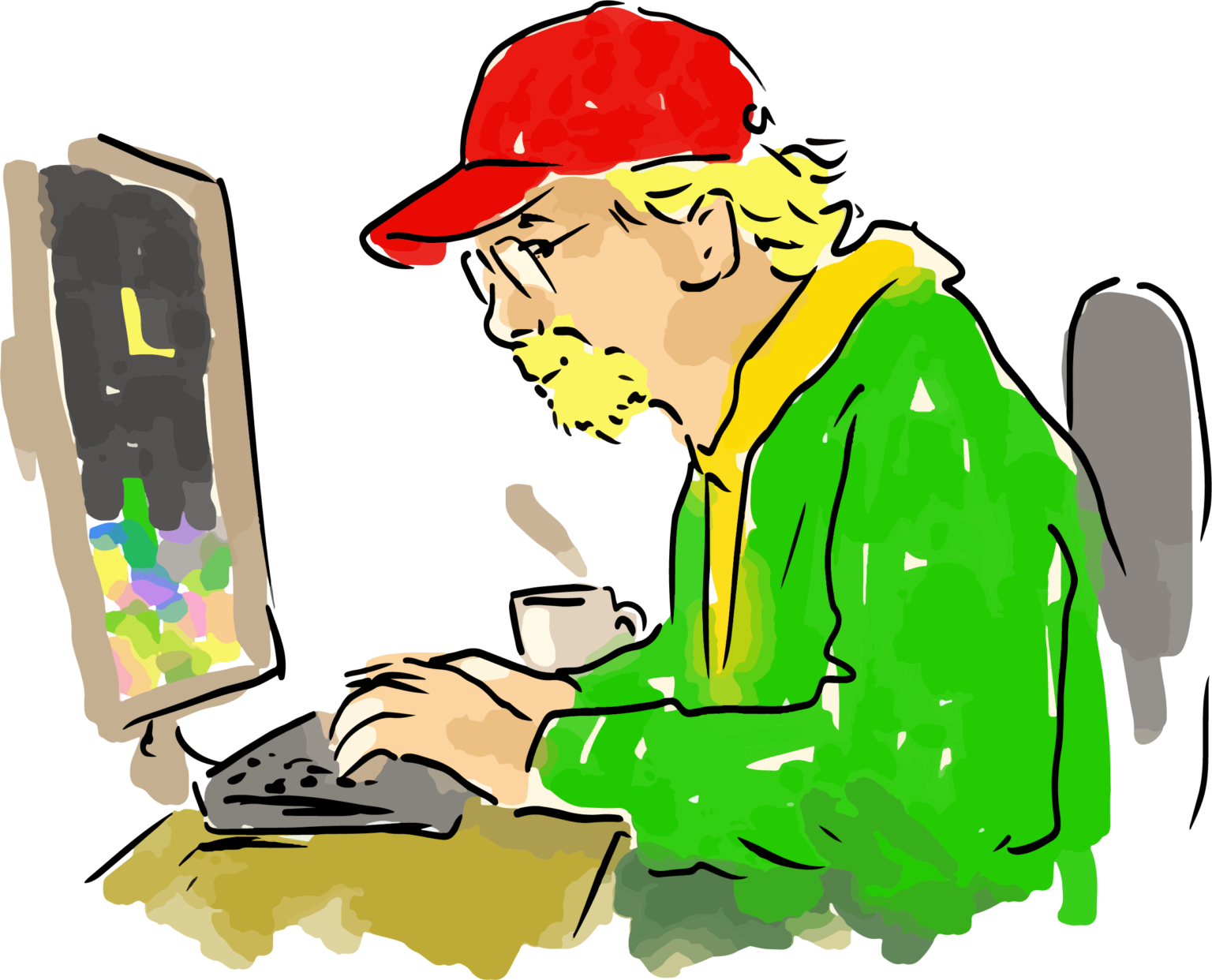
Spot illustrations / Helsinki Social and Health Services' rehabilitative work services
I drew hundred of spot illustrations for Helsinki Social and Health Services’ rehabilitative services to be used in flyers, newsletters, websites and such. What you see here is a mere fraction of the whole. I wanted to keep these spot illustrations sketchy and approachable, and drew most of them with a pen display. “Class photo” and “Celebration” are hand-drawn.
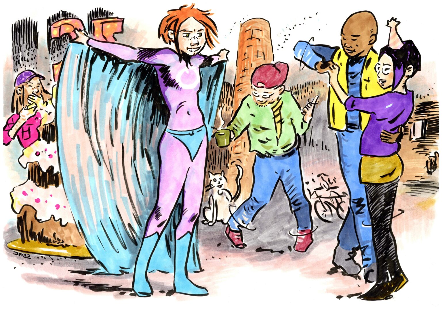
Spot illustrations / Helsinki Social and Health Services' rehabilitative work services
I drew hundred of spot illustrations for Helsinki Social and Health Services’ rehabilitative services to be used in flyers, newsletters, websites and such. What you see here is a mere fraction of the whole. I wanted to keep these spot illustrations sketchy and approachable, and drew most of them with a pen display. “Class photo” and “Celebration” are hand-drawn.
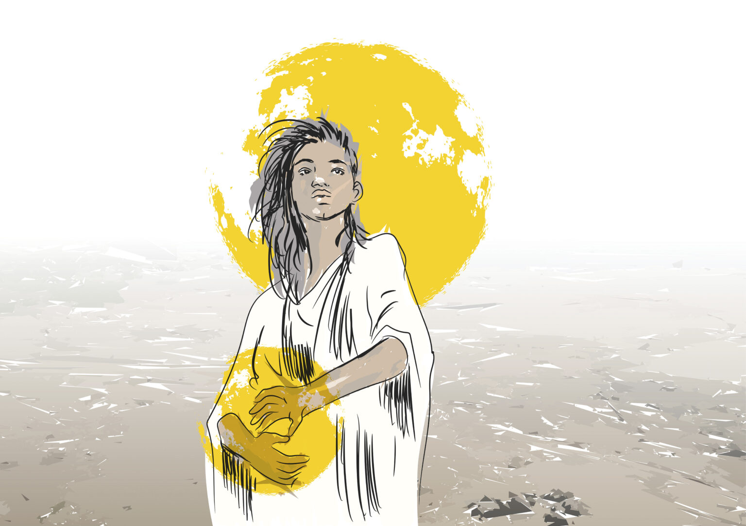
Themed illustrations / magazine illustration
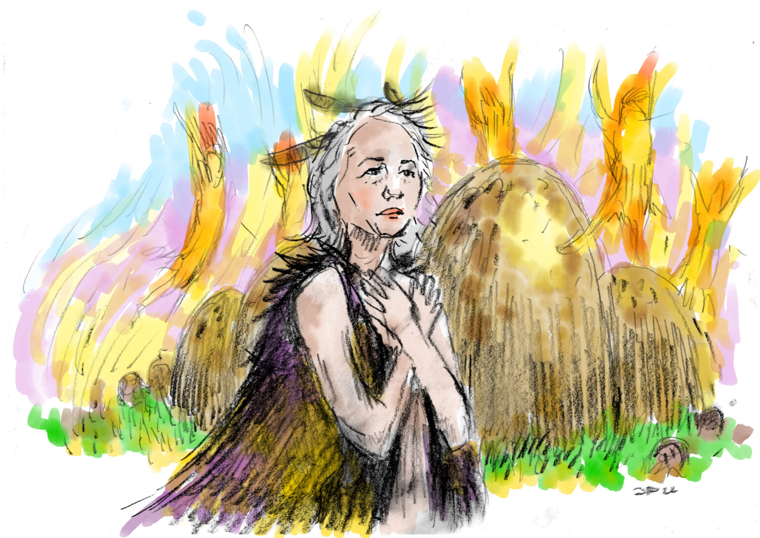
These illustrations were used as main images of their articles. Themes are history of Easter traditions, difficult weather forecasting, Kalevala in modern times, the anatomy of dreams, Valentine’s day, ADHD, and the history of Helsinki-style pronunciation. Apart from the second Easter illustration which is digitally colored charcoal drawing, and Kalevala piece which is an ink drawing colored with digital watercolors, other illustrations are combination of vector-based drawings on pen display and image processing.
Themed illustrations / magazine illustration
Click to see more about the project.
Themed illustrations / magazine illustration
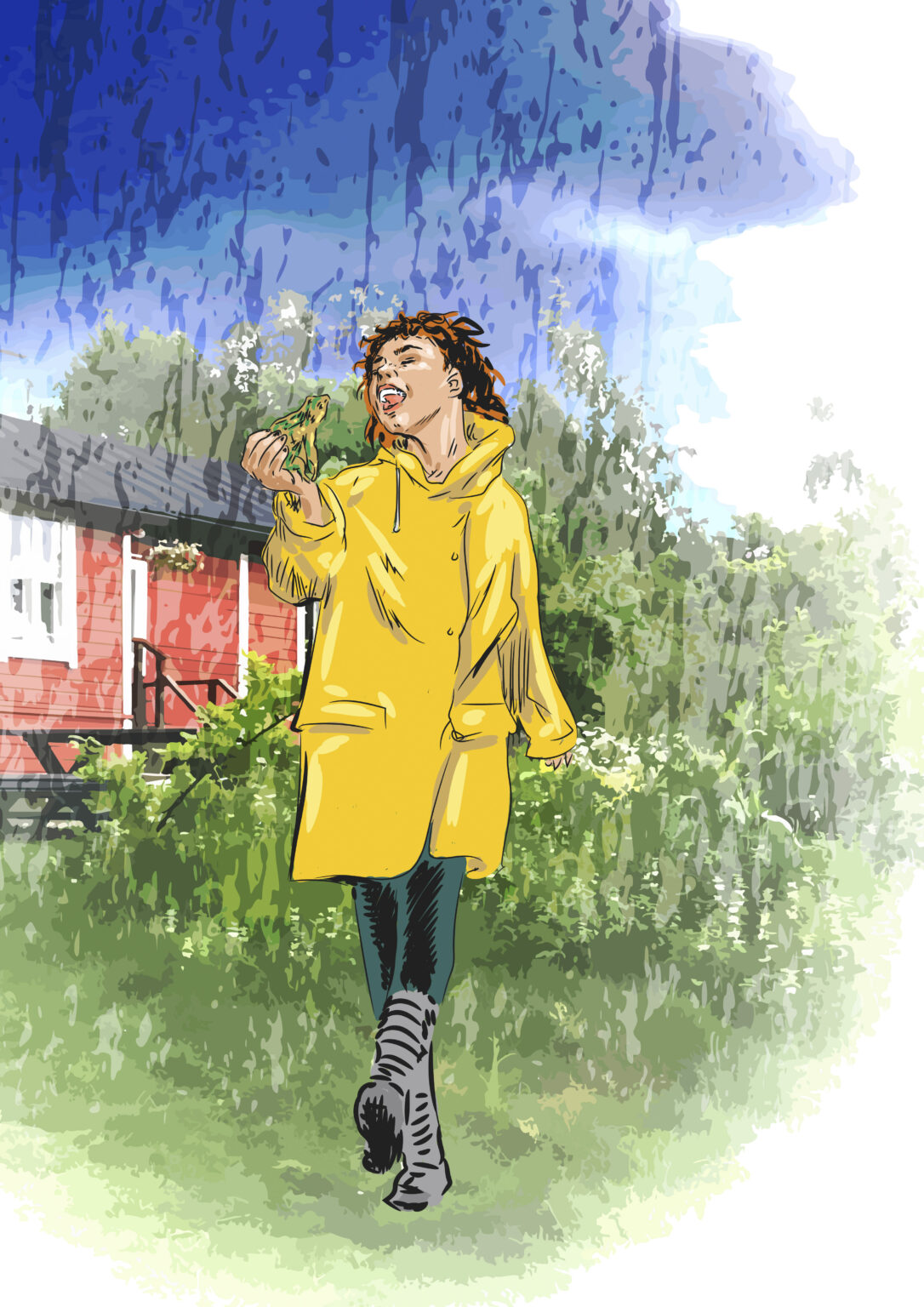
These illustrations were used as main images of their articles. Themes are history of Easter traditions, difficult weather forecasting, Kalevala in modern times, the anatomy of dreams, Valentine’s day, ADHD, and the history of Helsinki-style pronunciation. Apart from the second Easter illustration which is digitally colored charcoal drawing, and Kalevala piece which is an ink drawing colored with digital watercolors, other illustrations are combination of vector-based drawings on pen display and image processing.
Themed illustrations / magazine illustration
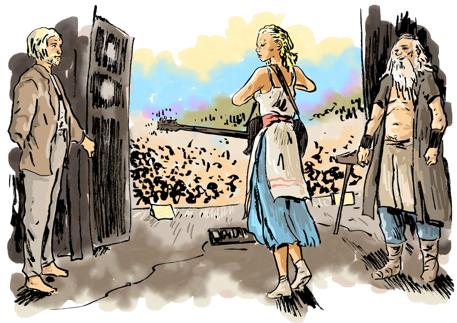
These illustrations were used as main images of their articles. Themes are history of Easter traditions, difficult weather forecasting, Kalevala in modern times, the anatomy of dreams, Valentine’s day, ADHD, and the history of Helsinki-style pronunciation. Apart from the second Easter illustration which is digitally colored charcoal drawing, and Kalevala piece which is an ink drawing colored with digital watercolors, other illustrations are combination of vector-based drawings on pen display and image processing.
Themed illustrations / magazine illustration
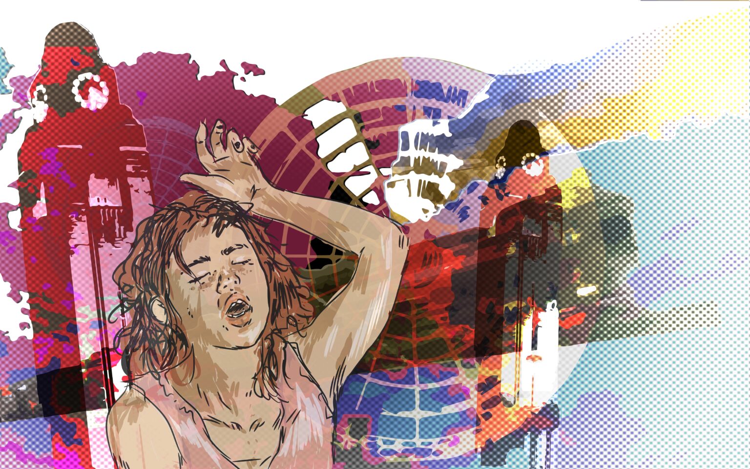
These illustrations were used as main images of their articles. Themes are history of Easter traditions, difficult weather forecasting, Kalevala in modern times, the anatomy of dreams, Valentine’s day, ADHD, and the history of Helsinki-style pronunciation. Apart from the second Easter illustration which is digitally colored charcoal drawing, and Kalevala piece which is an ink drawing colored with digital watercolors, other illustrations are combination of vector-based drawings on pen display and image processing.
Themed illustrations / magazine illustration
These illustrations were used as main images of their articles. Themes are history of Easter traditions, difficult weather forecasting, Kalevala in modern times, the anatomy of dreams, Valentine’s day, ADHD, and the history of Helsinki-style pronunciation. Apart from the second Easter illustration which is digitally colored charcoal drawing, and Kalevala piece which is an ink drawing colored with digital watercolors, other illustrations are combination of vector-based drawings on pen display and image processing.
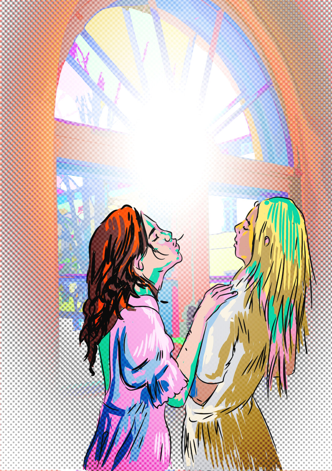
Themed illustrations / magazine illustration
These illustrations were used as main images of their articles. Themes are history of Easter traditions, difficult weather forecasting, Kalevala in modern times, the anatomy of dreams, Valentine’s day, ADHD, and the history of Helsinki-style pronunciation. Apart from the second Easter illustration which is digitally colored charcoal drawing, and Kalevala piece which is an ink drawing colored with digital watercolors, other illustrations are combination of vector-based drawings on pen display and image processing.
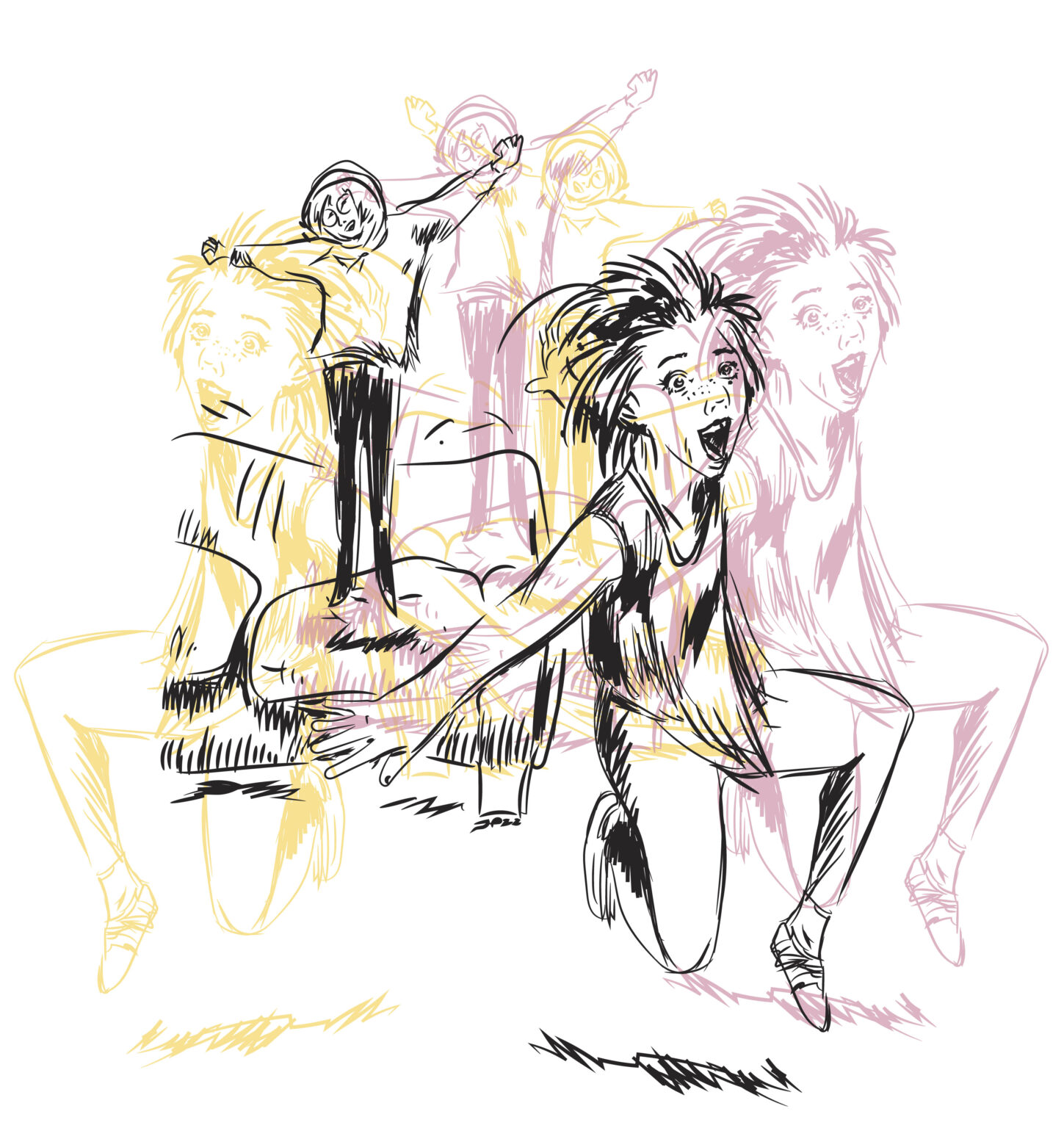
Themed illustrations / magazine illustration
These illustrations were used as main images of their articles. Themes are history of Easter traditions, difficult weather forecasting, Kalevala in modern times, the anatomy of dreams, Valentine’s day, ADHD, and the history of Helsinki-style pronunciation. Apart from the second Easter illustration which is digitally colored charcoal drawing, and Kalevala piece which is an ink drawing colored with digital watercolors, other illustrations are combination of vector-based drawings on pen display and image processing.
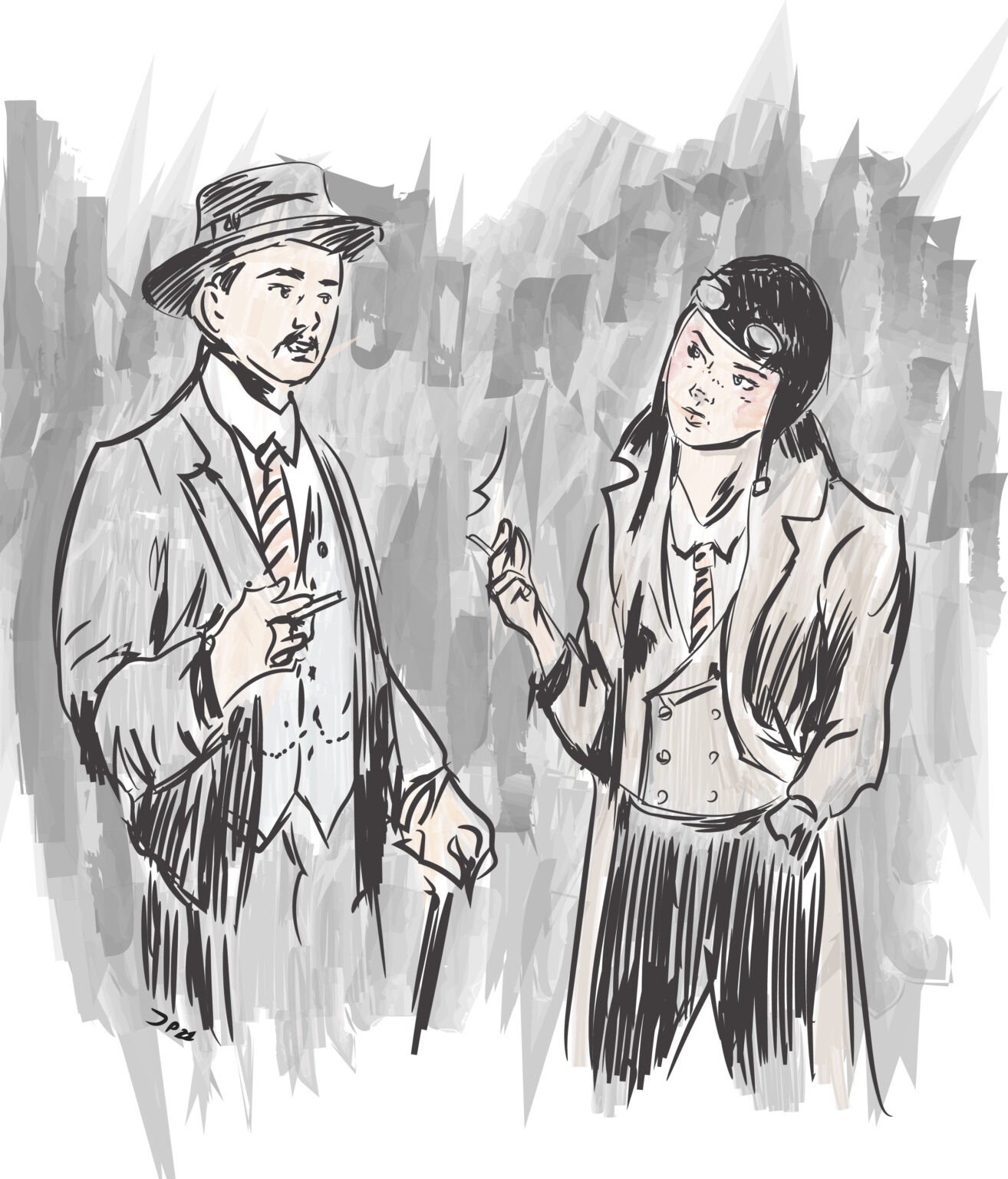
Themed illustrations / magazine illustration
These illustrations were used as main images of their articles. Themes are history of Easter traditions, difficult weather forecasting, Kalevala in modern times, the anatomy of dreams, Valentine’s day, ADHD, and the history of Helsinki-style pronunciation. Apart from the second Easter illustration which is digitally colored charcoal drawing, and Kalevala piece which is an ink drawing colored with digital watercolors, other illustrations are combination of vector-based drawings on pen display and image processing.
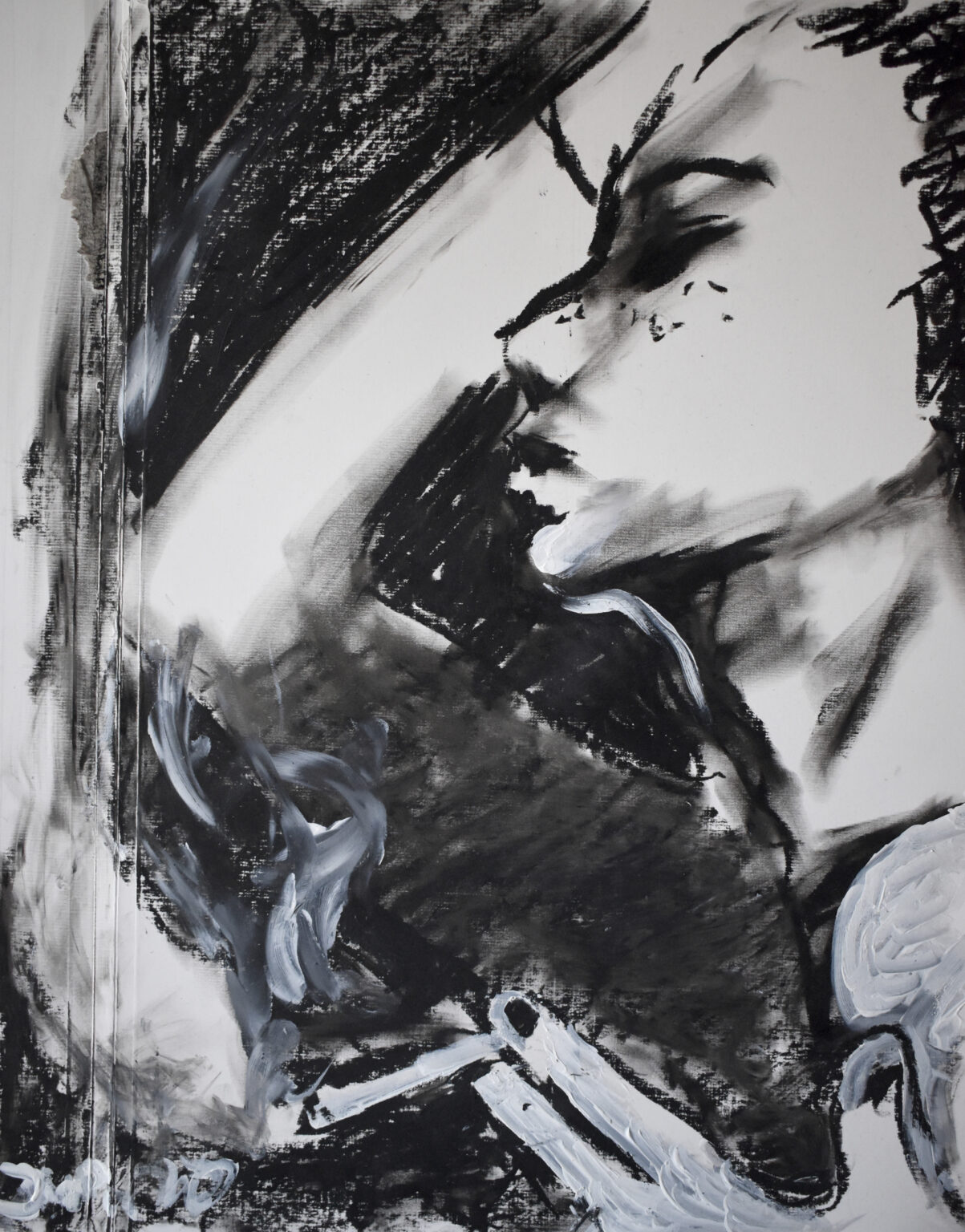
Notre Monde / private exhibition
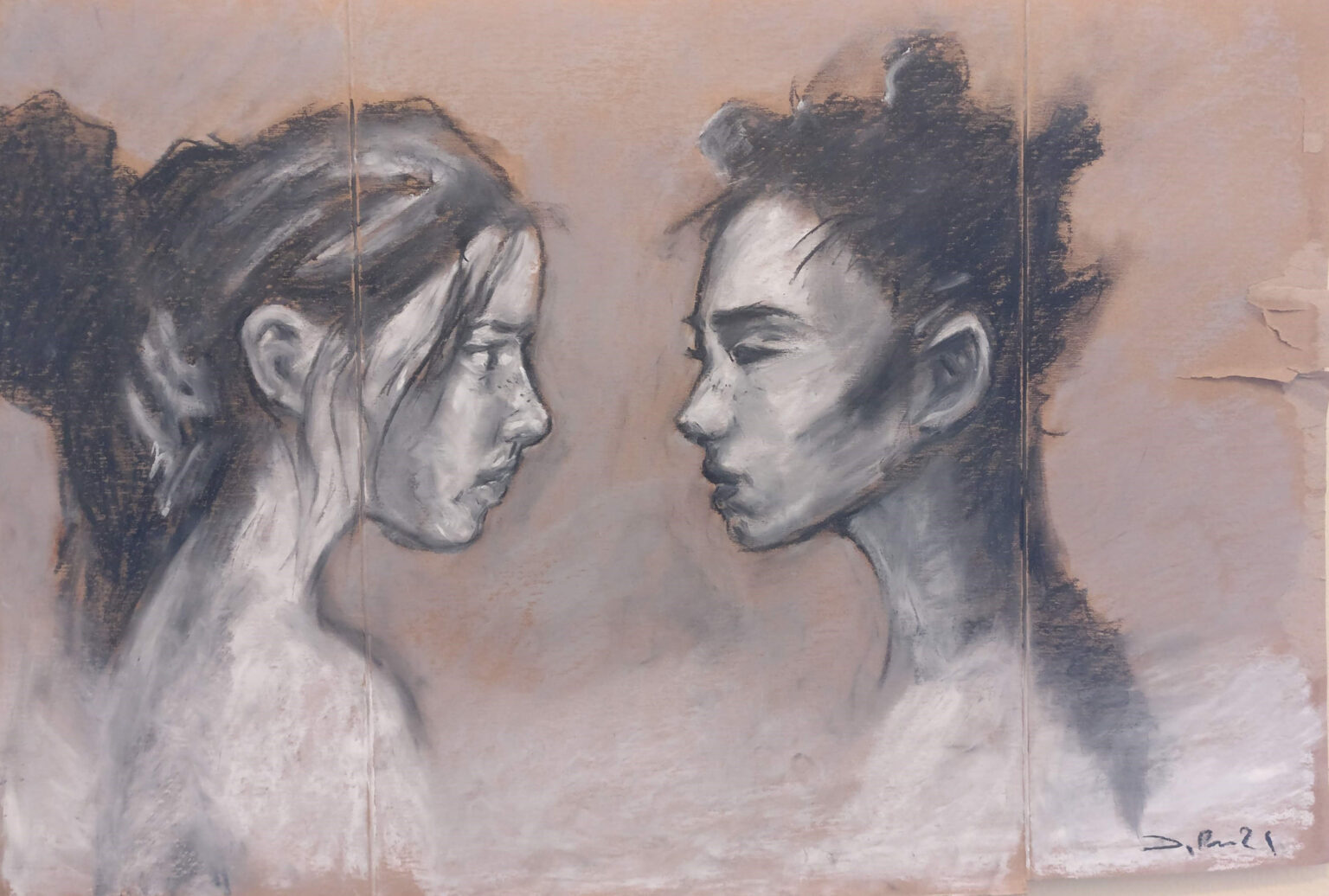
A few works from my exhibition Notre Monde, held in Lapinlahti corridor gallery in February 2022. I painted works with oil pastels on a recycled cardboard. As a material, it’s forgiving and flexible, and costs nothing. I still make painting with same materials.
Notre Monde / private exhibition
Click to see more about the project.
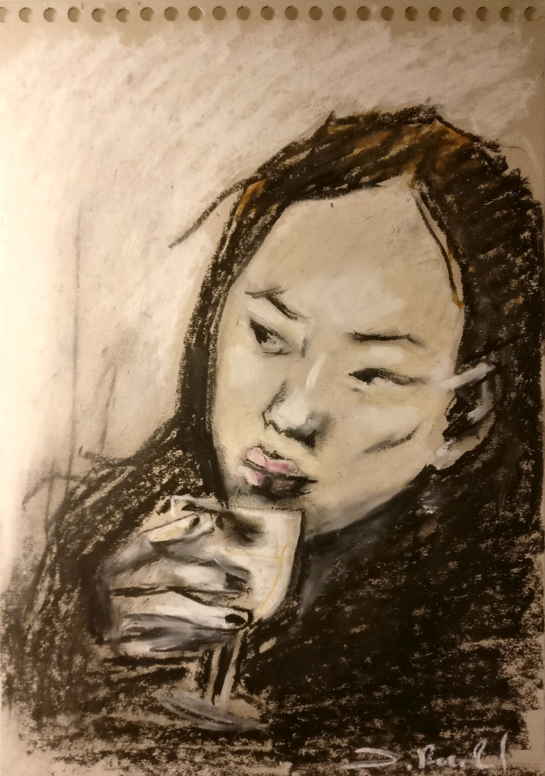
Notre Monde / private exhibition
A few works from my exhibition Notre Monde, held in Lapinlahti corridor gallery in February 2022. I painted works with oil pastels on a recycled cardboard. As a material, it’s forgiving and flexible, and costs nothing. I still make painting with same materials.
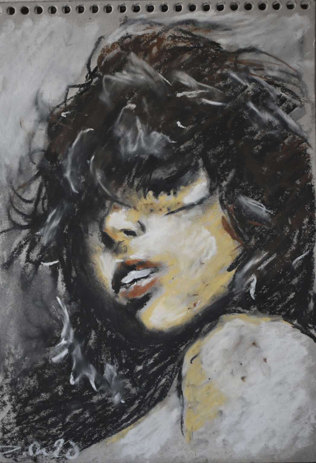
Notre Monde / private exhibition
A few works from my exhibition Notre Monde, held in Lapinlahti corridor gallery in February 2022. I painted works with oil pastels on a recycled cardboard. As a material, it’s forgiving and flexible, and costs nothing. I still make painting with same materials.
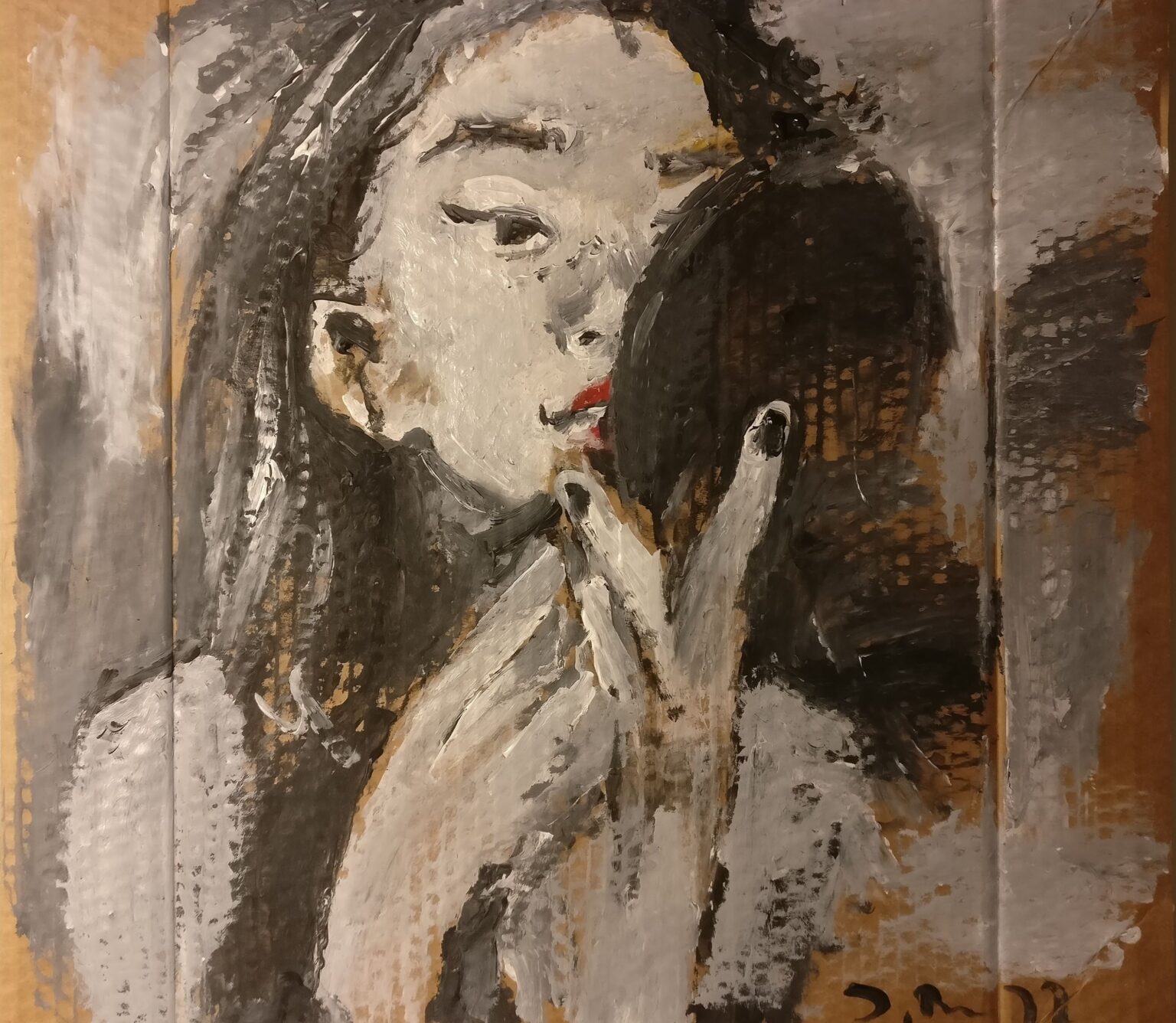
Notre Monde / private exhibition
A few works from my exhibition Notre Monde, held in Lapinlahti corridor gallery in February 2022. I painted works with oil pastels on a recycled cardboard. As a material, it’s forgiving and flexible, and costs nothing. I still make painting with same materials.
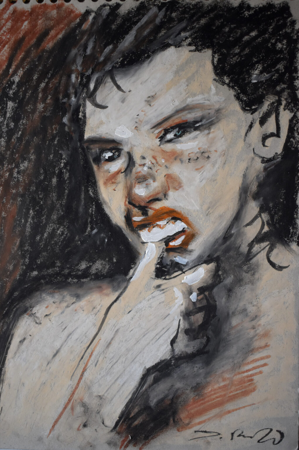
Notre Monde / private exhibition
A few works from my exhibition Notre Monde, held in Lapinlahti corridor gallery in February 2022. I painted works with oil pastels on a recycled cardboard. As a material, it’s forgiving and flexible, and costs nothing. I still make painting with same materials.
Notre Monde / private exhibition
A few works from my exhibition Notre Monde, held in Lapinlahti corridor gallery in February 2022. I painted works with oil pastels on a recycled cardboard. As a material, it’s forgiving and flexible, and costs nothing. I still make painting with same materials.
Cover illustrations / customer magazine
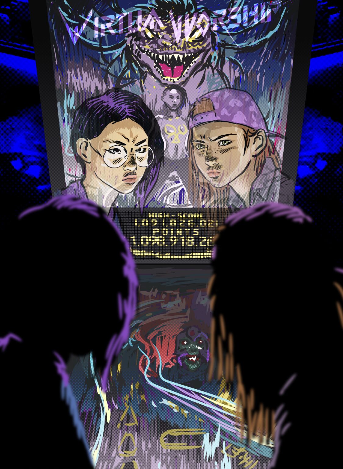
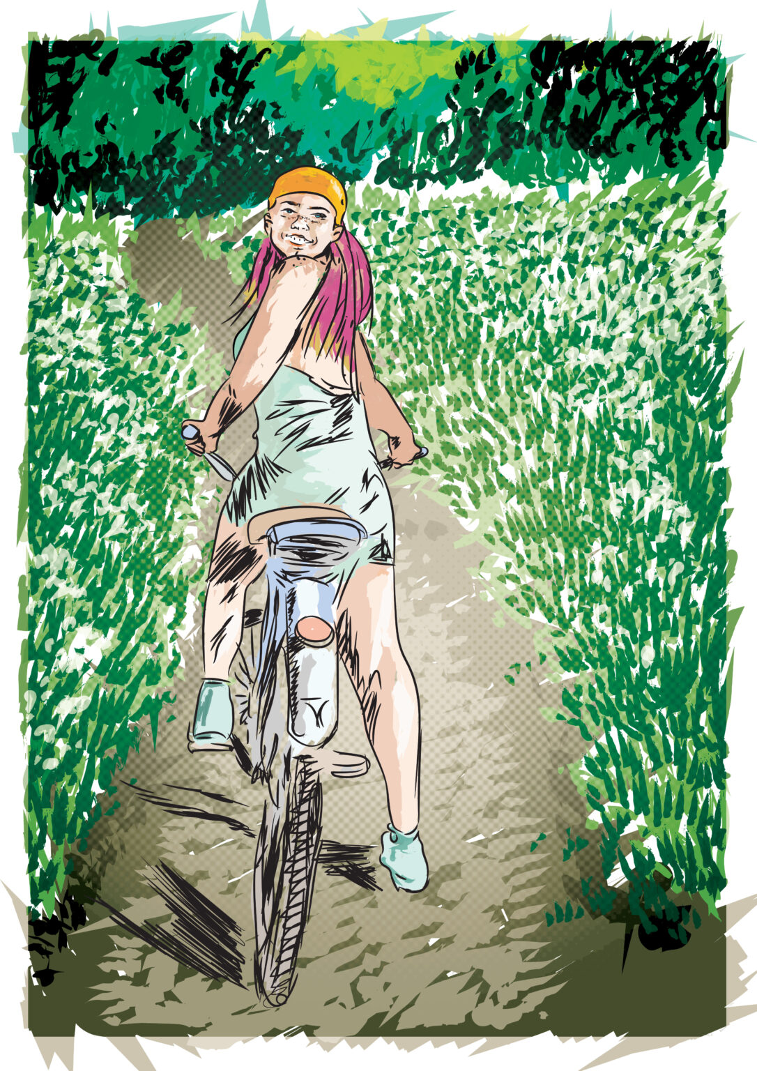
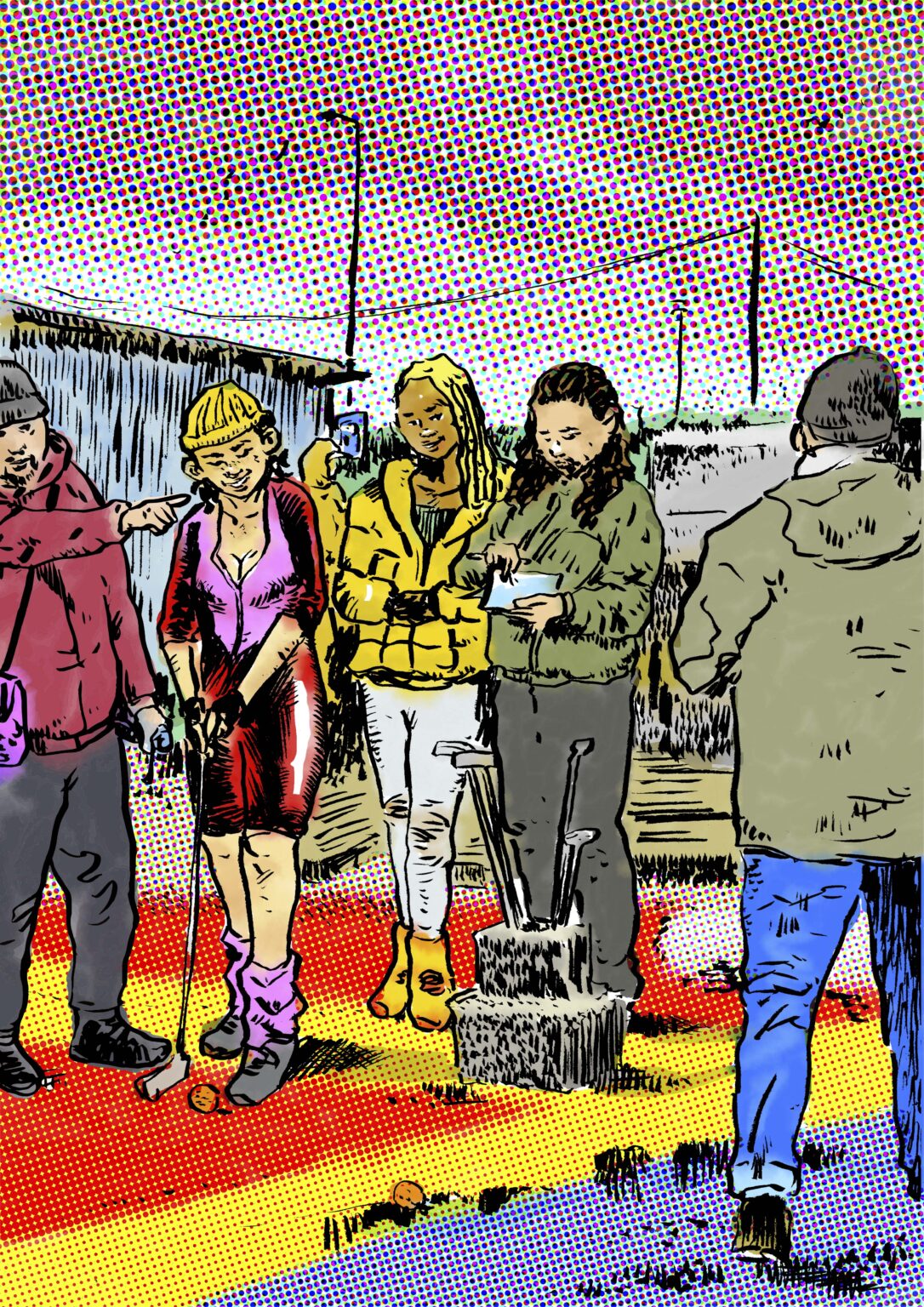
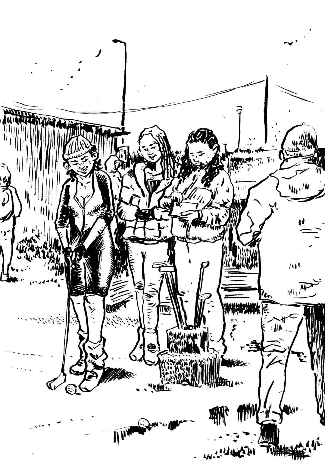
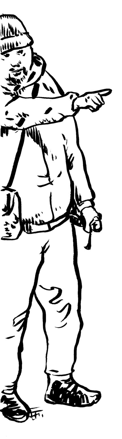
Pinball image is a sum of many parts. The players, which I treated to appear as reflections, are hand-drawn and colored with computer. Their shadowy blurred figures bring depth. The flipper is a separate digital illustration, and behind it all, a stylized photograph. In the second cover (vector-based illustration) a summer adventure begins. The second illustration about casual games (ink line art, computer colors) shows how the model who initially wanted to be left out wanted to be involved after all.
Cover illustrations / customer magazine
Click to see more about the project.
Cover illustrations / customer magazine
Pinball image is a sum of many parts. The players, which I treated to appear as reflections, are hand-drawn and colored with computer. Their shadowy blurred figures bring depth. The flipper is a separate digital illustration, and behind it all, a stylized photograph. In the second cover (vector-based illustration) a summer adventure begins. The second illustration about casual games (ink line art, computer colors) shows how the model who initially wanted to be left out wanted to be involved after all.
Cover illustrations / customer magazine
Pinball image is a sum of many parts. The players, which I treated to appear as reflections, are hand-drawn and colored with computer. Their shadowy blurred figures bring depth. The flipper is a separate digital illustration, and behind it all, a stylized photograph. In the second cover (vector-based illustration) a summer adventure begins. The second illustration about casual games (ink line art, computer colors) shows how the model who initially wanted to be left out wanted to be involved after all.
Cover illustrations / customer magazine
Pinball image is a sum of many parts. The players, which I treated to appear as reflections, are hand-drawn and colored with computer. Their shadowy blurred figures bring depth. The flipper is a separate digital illustration, and behind it all, a stylized photograph. In the second cover (vector-based illustration) a summer adventure begins. The second illustration about casual games (ink line art, computer colors) shows how the model who initially wanted to be left out wanted to be involved after all.
Cover illustrations / customer magazine
Pinball image is a sum of many parts. The players, which I treated to appear as reflections, are hand-drawn and colored with computer. Their shadowy blurred figures bring depth. The flipper is a separate digital illustration, and behind it all, a stylized photograph. In the second cover (vector-based illustration) a summer adventure begins. The second illustration about casual games (ink line art, computer colors) shows how the model who initially wanted to be left out wanted to be involved after all.
Guide to Job Search Obligation / employment services
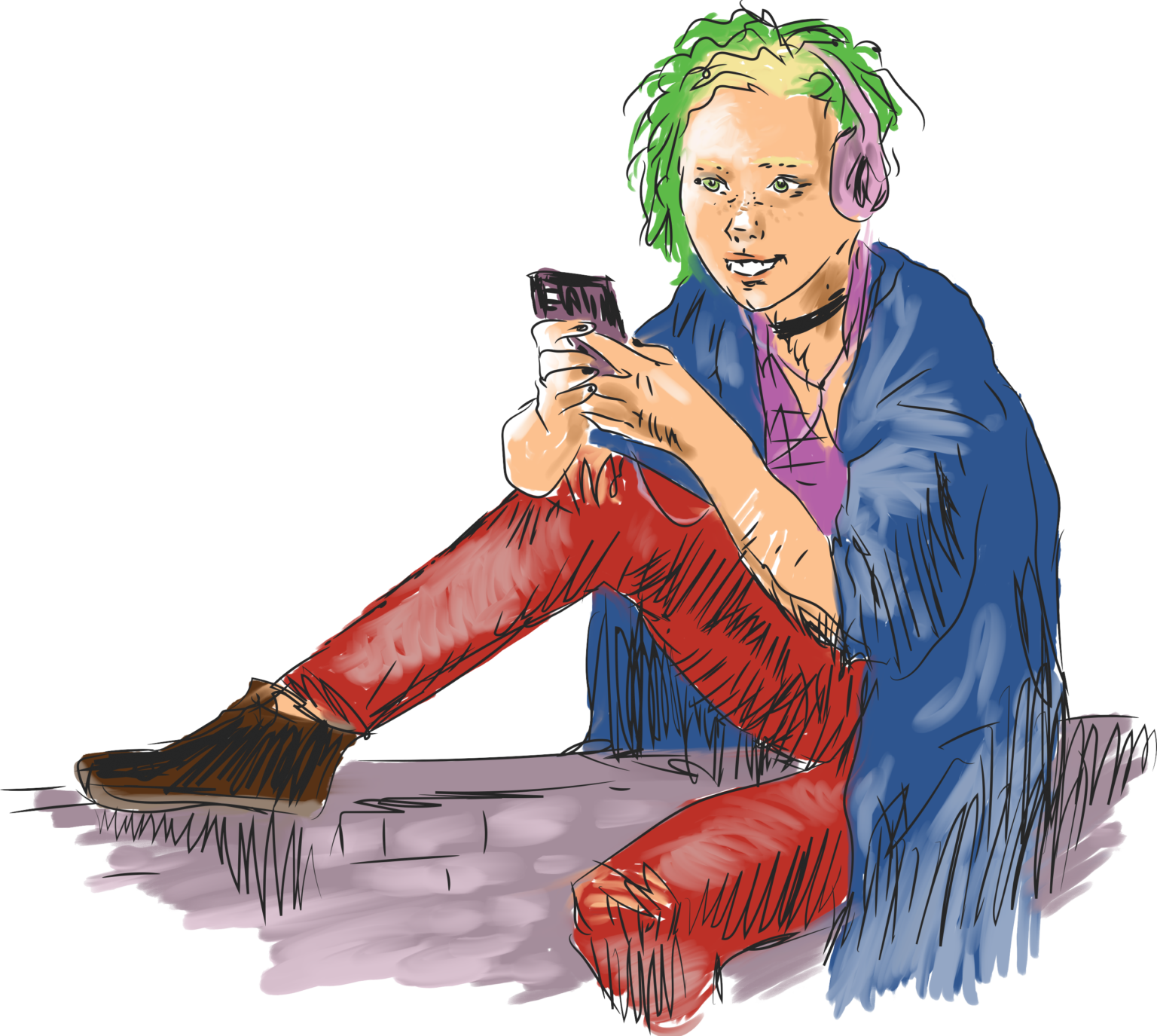
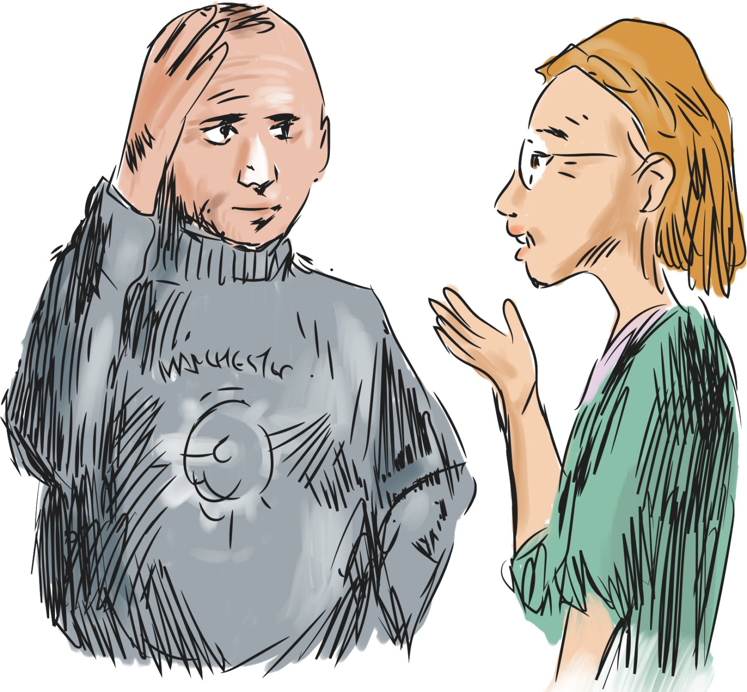
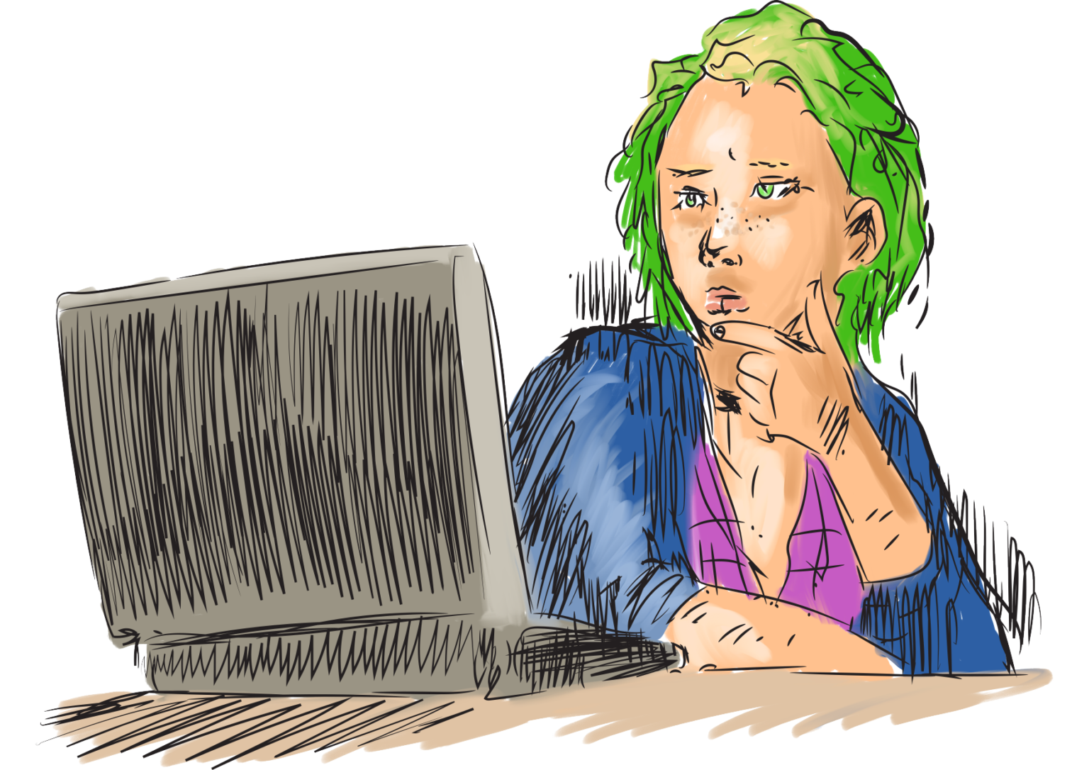
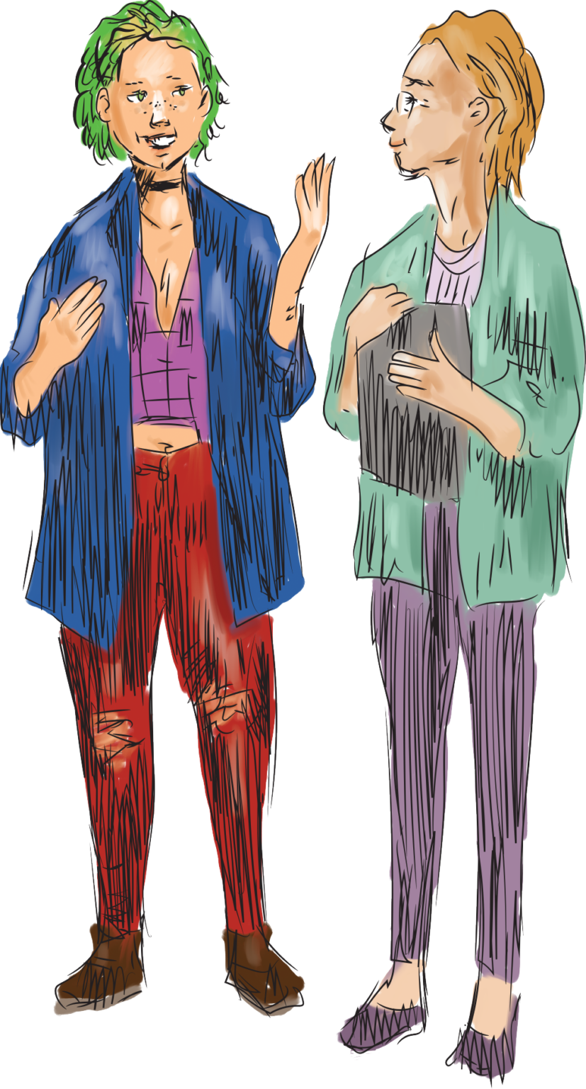
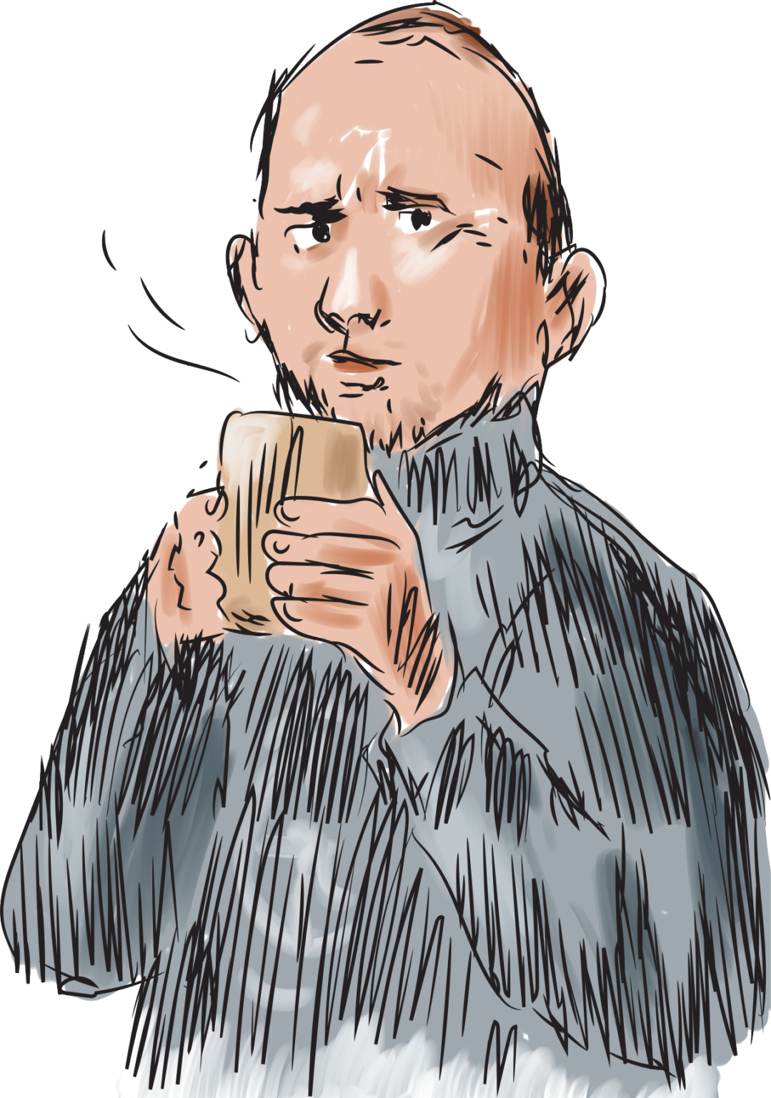
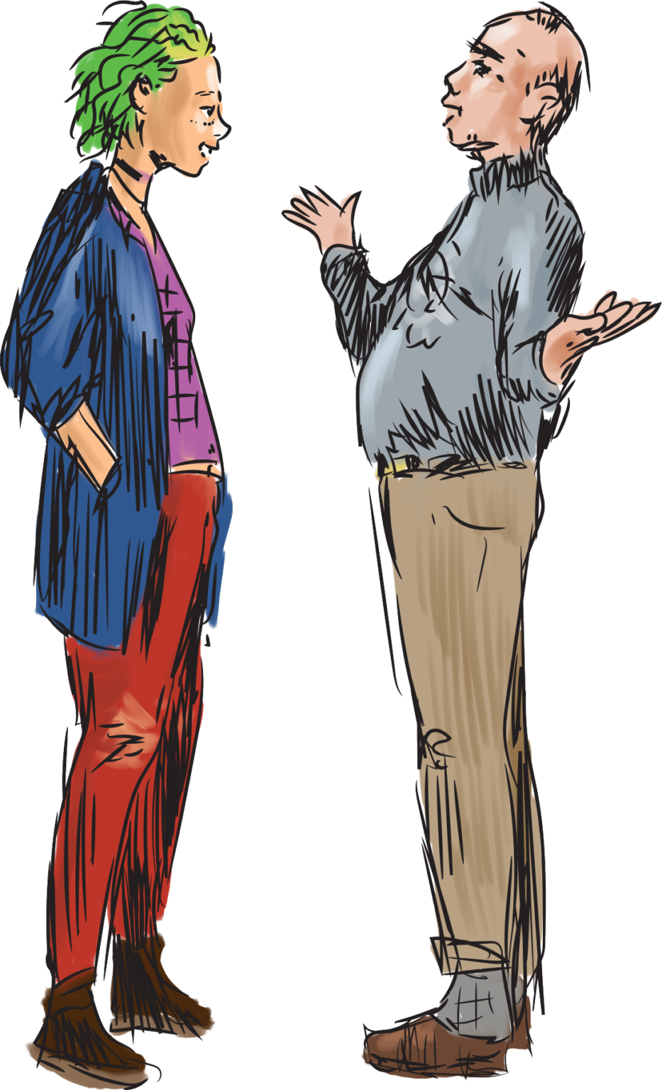
I drew and designed a guide to job search obligation. It features two protagonists; Emmi represents the youth, while Matti embodies an older long-term unemployed who faces difficulties in finding employment. I drew outlines with Illustrators and colors with Photoshop. I wanted a quick, sketchy look. The guide was published in a magazine for rehabilitative work activities, and it was also available in employment offuces.
Guide to Job Search Obligation / employment services
Click to see more about the project.
Guide to Job Search Obligation / employment services
I drew and designed a guide to job search obligation. It features two protagonists; Emmi represents the youth, while Matti embodies an older long-term unemployed who faces difficulties in finding employment. I drew outlines with Illustrators and colors with Photoshop. I wanted a quick, sketchy look. The guide was published in a magazine for rehabilitative work activities, and it was also available in employment offuces.
Guide to Job Search Obligation / employment services
I drew and designed a guide to job search obligation. It features two protagonists; Emmi represents the youth, while Matti embodies an older long-term unemployed who faces difficulties in finding employment. I drew outlines with Illustrators and colors with Photoshop. I wanted a quick, sketchy look. The guide was published in a magazine for rehabilitative work activities, and it was also available in employment offuces.
Guide to Job Search Obligation / employment services
I drew and designed a guide to job search obligation. It features two protagonists; Emmi represents the youth, while Matti embodies an older long-term unemployed who faces difficulties in finding employment. I drew outlines with Illustrators and colors with Photoshop. I wanted a quick, sketchy look. The guide was published in a magazine for rehabilitative work activities, and it was also available in employment offuces.
Guide to Job Search Obligation / employment services
I drew and designed a guide to job search obligation. It features two protagonists; Emmi represents the youth, while Matti embodies an older long-term unemployed who faces difficulties in finding employment. I drew outlines with Illustrators and colors with Photoshop. I wanted a quick, sketchy look. The guide was published in a magazine for rehabilitative work activities, and it was also available in employment offuces.
Guide to Job Search Obligation / employment services
I drew and designed a guide to job search obligation. It features two protagonists; Emmi represents the youth, while Matti embodies an older long-term unemployed who faces difficulties in finding employment. I drew outlines with Illustrators and colors with Photoshop. I wanted a quick, sketchy look. The guide was published in a magazine for rehabilitative work activities, and it was also available in employment offuces.
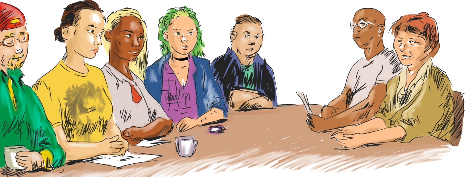
Guide to Job Search Obligation / employment services
I drew and designed a guide to job search obligation. It features two protagonists; Emmi represents the youth, while Matti embodies an older long-term unemployed who faces difficulties in finding employment. I drew outlines with Illustrators and colors with Photoshop. I wanted a quick, sketchy look. The guide was published in a magazine for rehabilitative work activities, and it was also available in employment offuces.
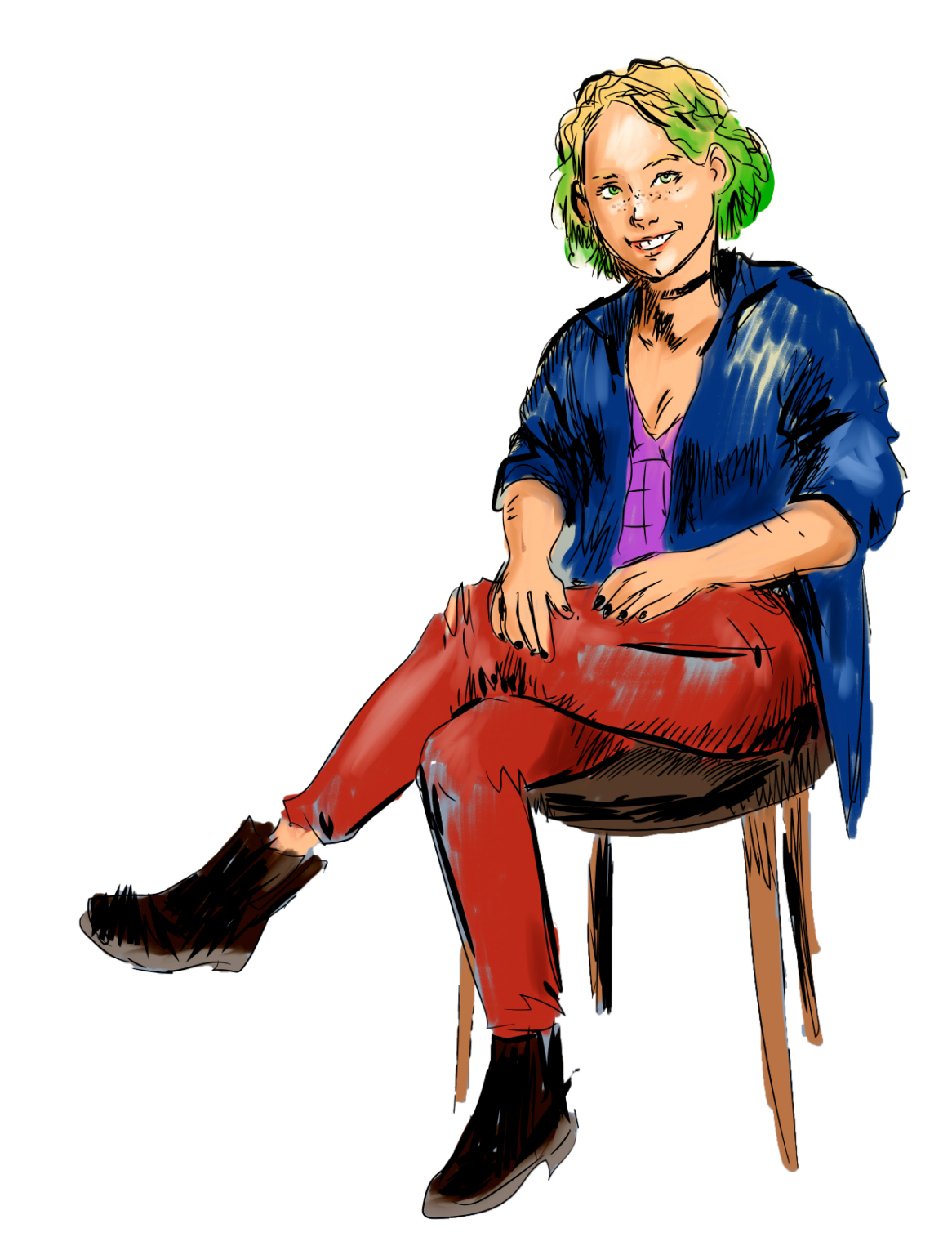
Guide to Job Search Obligation / employment services
I drew and designed a guide to job search obligation. It features two protagonists; Emmi represents the youth, while Matti embodies an older long-term unemployed who faces difficulties in finding employment. I drew outlines with Illustrators and colors with Photoshop. I wanted a quick, sketchy look. The guide was published in a magazine for rehabilitative work activities, and it was also available in employment offuces.
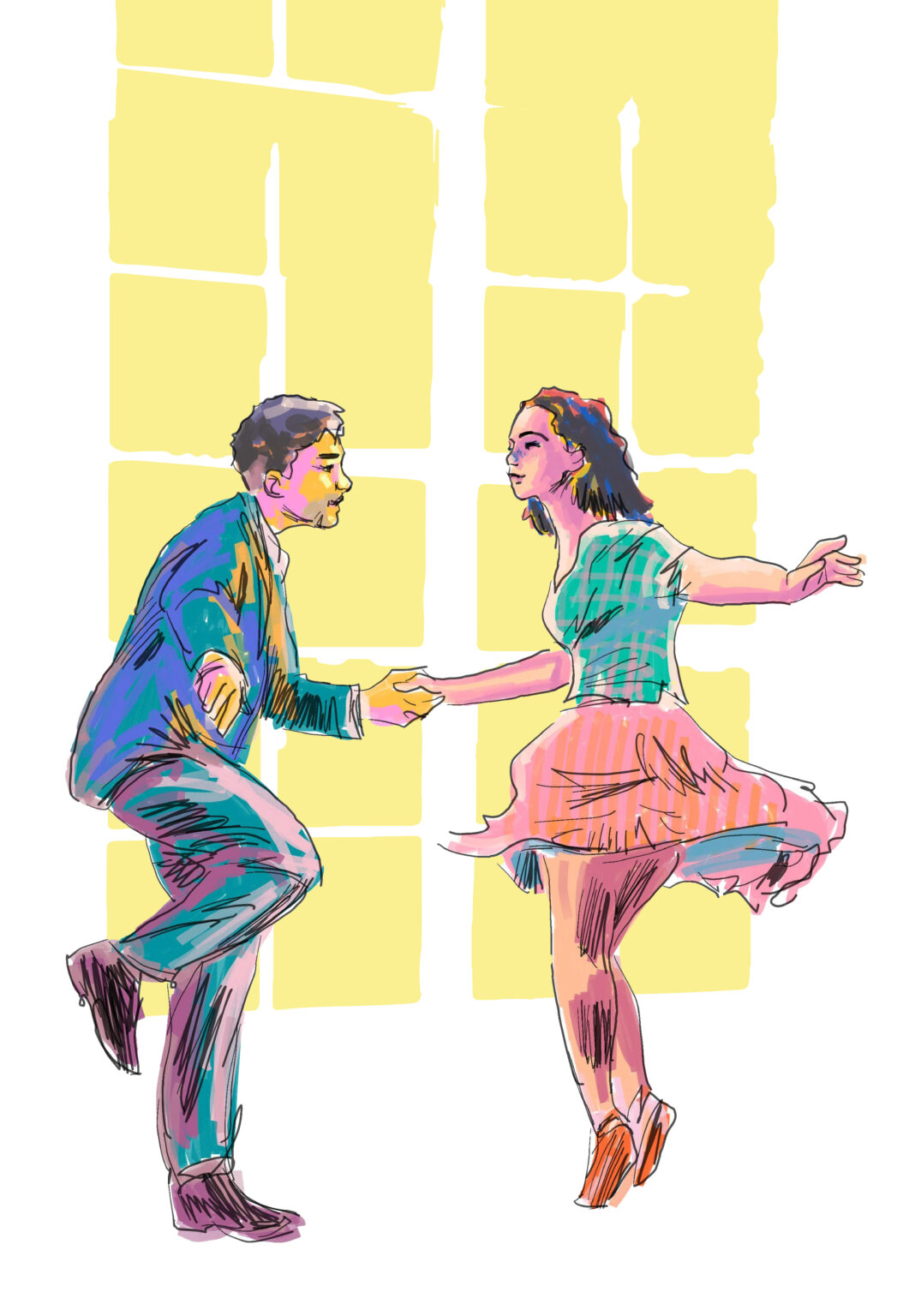
Let's dance / magazine illustration
I pondered how I could convey the movement of dance to a illustration for an article about balldroom dancing. So, I chose to drew dancers with an Android tablet. The window behind them is vector graphics.
Let's dance / magazine illustration
Click to see more about the project.
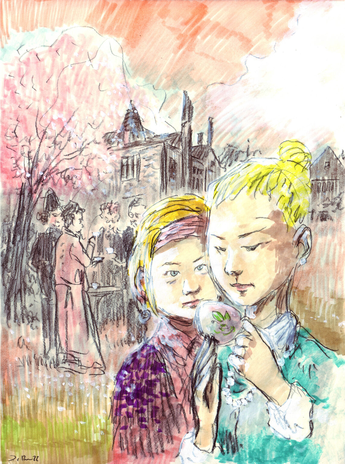
A summery whodunit / a serial in portal
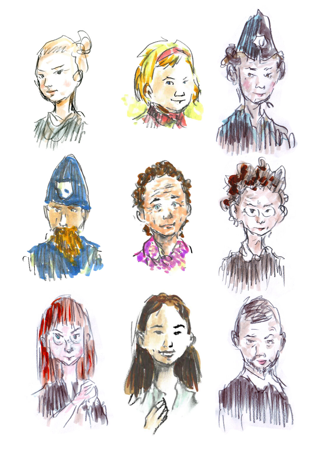
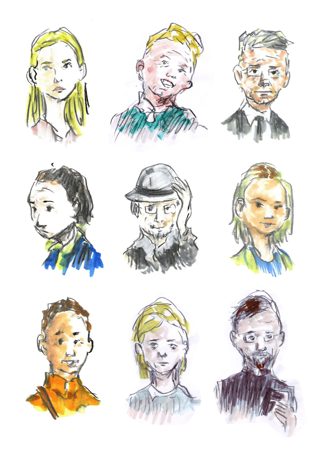
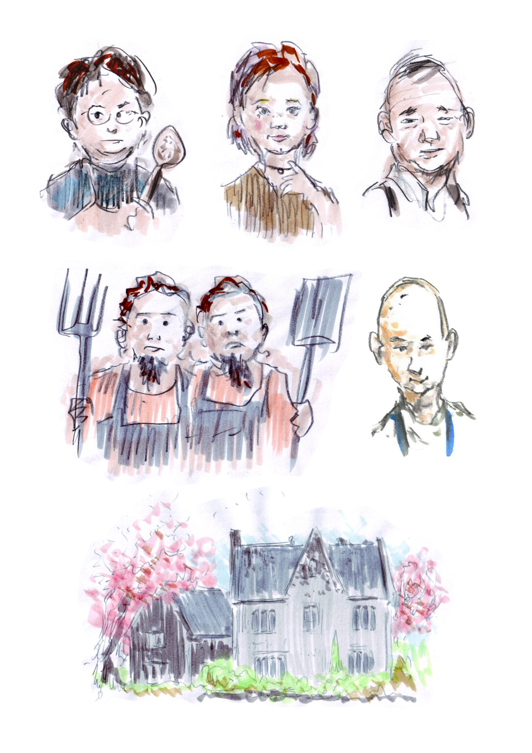
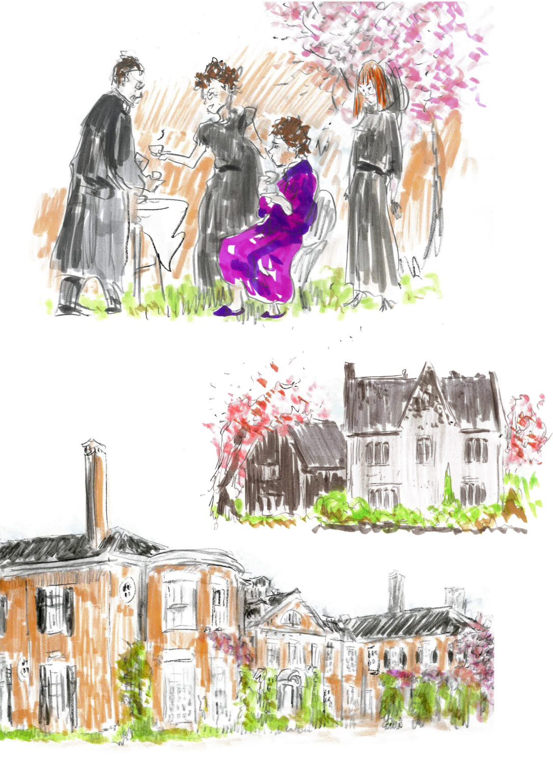
My colleague wrote a multi-part, ashamedly Agatha Christie-style whodunit which took place in 1920’s England on a posh mansion grounds. It was published in a web portal and at certain junctions, the reader got to choose the direction of the story. Together with the author, we brainstormed appearances of the cast and locales. I drew these illustrations with pencil and colored with comic markers. As an intended contrast to the digital publishig format, pictures’ appearance is rough and rustic.
A summery whodunit / a serial in portal
Click to see more about the project.
A summery whodunit / a serial in portal
My colleague wrote a multi-part, ashamedly Agatha Christie-style whodunit which took place in 1920’s England on a posh mansion grounds. It was published in a web portal and at certain junctions, the reader got to choose the direction of the story. Together with the author, we brainstormed appearances of the cast and locales. I drew these illustrations with pencil and colored with comic markers. As an intended contrast to the digital publishig format, pictures’ appearance is rough and rustic.
A summery whodunit / a serial in portal
My colleague wrote a multi-part, ashamedly Agatha Christie-style whodunit which took place in 1920’s England on a posh mansion grounds. It was published in a web portal and at certain junctions, the reader got to choose the direction of the story. Together with the author, we brainstormed appearances of the cast and locales. I drew these illustrations with pencil and colored with comic markers. As an intended contrast to the digital publishig format, pictures’ appearance is rough and rustic.
A summery whodunit / a serial in portal
My colleague wrote a multi-part, ashamedly Agatha Christie-style whodunit which took place in 1920’s England on a posh mansion grounds. It was published in a web portal and at certain junctions, the reader got to choose the direction of the story. Together with the author, we brainstormed appearances of the cast and locales. I drew these illustrations with pencil and colored with comic markers. As an intended contrast to the digital publishig format, pictures’ appearance is rough and rustic.
A summery whodunit / a serial in portal
My colleague wrote a multi-part, ashamedly Agatha Christie-style whodunit which took place in 1920’s England on a posh mansion grounds. It was published in a web portal and at certain junctions, the reader got to choose the direction of the story. Together with the author, we brainstormed appearances of the cast and locales. I drew these illustrations with pencil and colored with comic markers. As an intended contrast to the digital publishig format, pictures’ appearance is rough and rustic.
A summery whodunit / a serial in portal
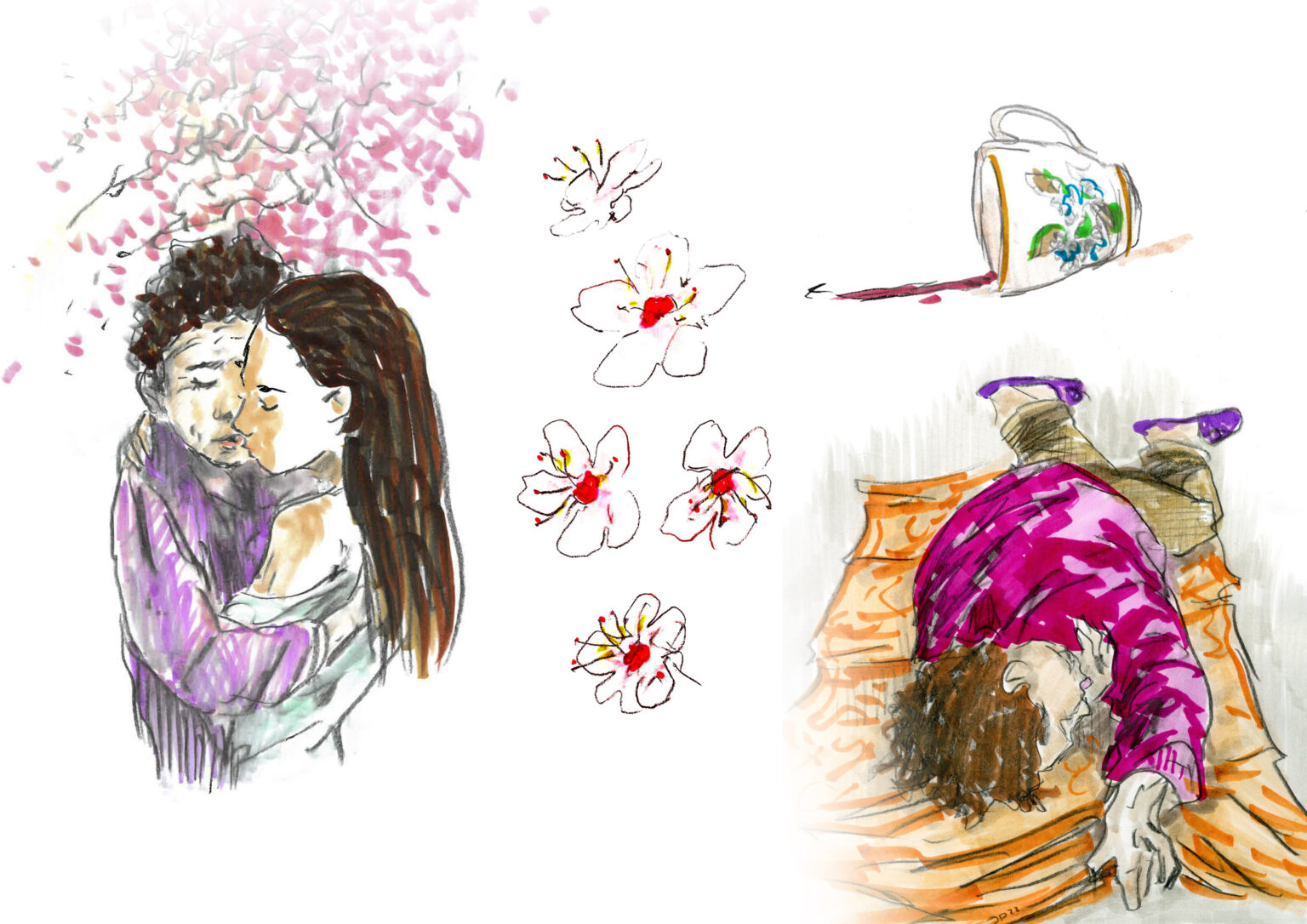
My colleague wrote a multi-part, ashamedly Agatha Christie-style whodunit which took place in 1920’s England on a posh mansion grounds. It was published in a web portal and at certain junctions, the reader got to choose the direction of the story. Together with the author, we brainstormed appearances of the cast and locales. I drew these illustrations with pencil and colored with comic markers. As an intended contrast to the digital publishig format, pictures’ appearance is rough and rustic.
A summery whodunit / a serial in portal
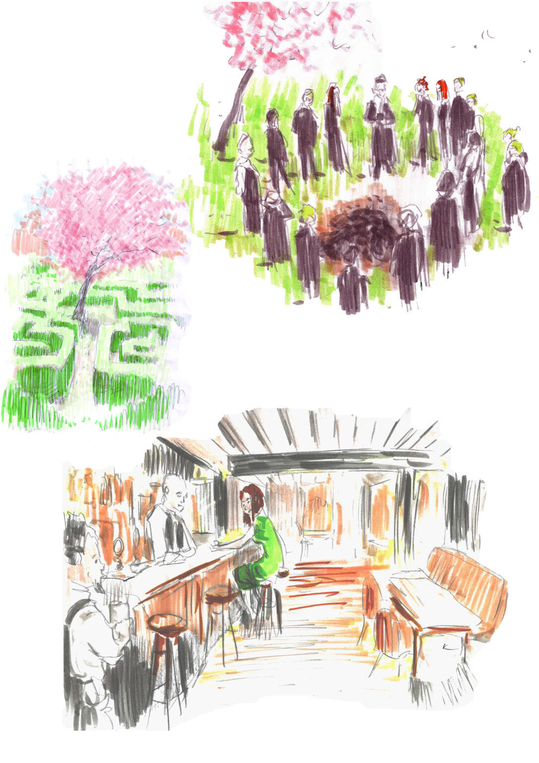
My colleague wrote a multi-part, ashamedly Agatha Christie-style whodunit which took place in 1920’s England on a posh mansion grounds. It was published in a web portal and at certain junctions, the reader got to choose the direction of the story. Together with the author, we brainstormed appearances of the cast and locales. I drew these illustrations with pencil and colored with comic markers. As an intended contrast to the digital publishig format, pictures’ appearance is rough and rustic.