
Hanna Lahti
Hey! I am Hanna Lahti, a graphic designer and illustrator from Helsinki. I have been working since 2003 as a freelance illustrator.
I am a relentless enthusiast for creative projects and a good manager of myself. I prefer to make a brisk start to my design work from the very beginning. My strengths are cooperation skills honed in meetings with partners, quick decision making and sticking to deadlines. In my spare time I enjoy jogging by the Baltic sea, cultural events and being inspired by nature and museums.
My office is located in the heart of Helsinki. Invoicing is easy with me, because I work under a business name. During my years as an entrepreneur, I have had time to gain versatile experience as an illustrator: my commissions have ranged from individual vignettes to the realization of a festival look. For new jobs, I choose the most appropriate style from my palette. I am always interested in trying new things as well. My working languages are Finnish and English.
My specialty is combining illustration and graphic design. I prefer to work completely digitally. Do you need a unique story and moving image to support your message? Succeed! As a sideline, I create a variety of video content, starting from the script. More work samples can be found on my company's website.
Gummerus Publishing, S&S Publishing, Aalto University, Gaudeamus Oy Publishing, Otava Publishing, Sanoma Pro Publishing, Helsingin Sanomat Newspaper, Ilta-Sanomat Mazagine, Intiim, Journalisti Magazine, Kotipuutarha Magazine, Terassi Magazine, Motiivi Magazine, The Union of Journalists in Finland, The Council for Mass Media in Finland, TEAM Trade Union, Parliament of Finland, National Audiovisual Institute, Pro Medico, The Finnish Film Foundation, The Cancer Society of Finland, The Finnish Refugee Council, Måndag, University of Eastern Finland
"Hanna has made a series of wonderful drawings of our columnists for us at Journalist, which illustrate the essay authors' texts. The illustrations bring out the authors' personalities in an interesting way. Hanna is a quick and idea-rich illustrator with whom cooperation is uncomplicated."
-Heli Saarela, AD of Journalisti magazine
"Hanna Lahti has designed many book covers for Gaudeamus over the years. The covers have been insightful, beautiful and suitable for the subject of the book. The cooperation has always been smooth and pleasant."
-Leena Kaakinen, publishing director, Gaudeamus
My project
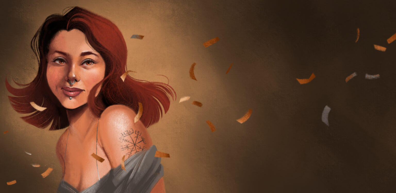
Illustration, personal use (2021).
My project
Click to see more about the project.
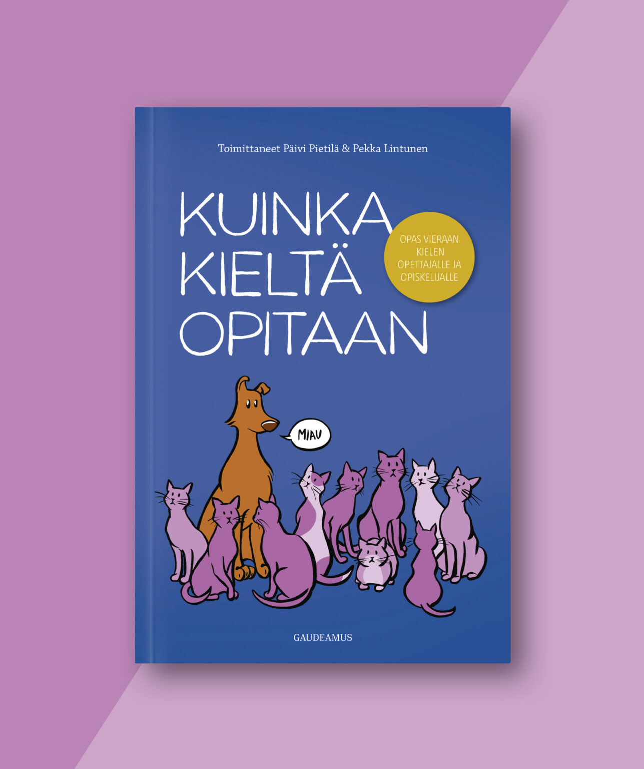
Book cover design / Gaudeamus
Cover design and illustration for the book "How to learn a language - a guide for foreign language teachers and students" (2014). The cover art takes a humorous approach to the subject: through a dog talking "cat" and a herd of native speakers, it depicts exposure to a foreign language and language-immersed learning in a foreign environment.
Book cover design / Gaudeamus
Click to see more about the project.
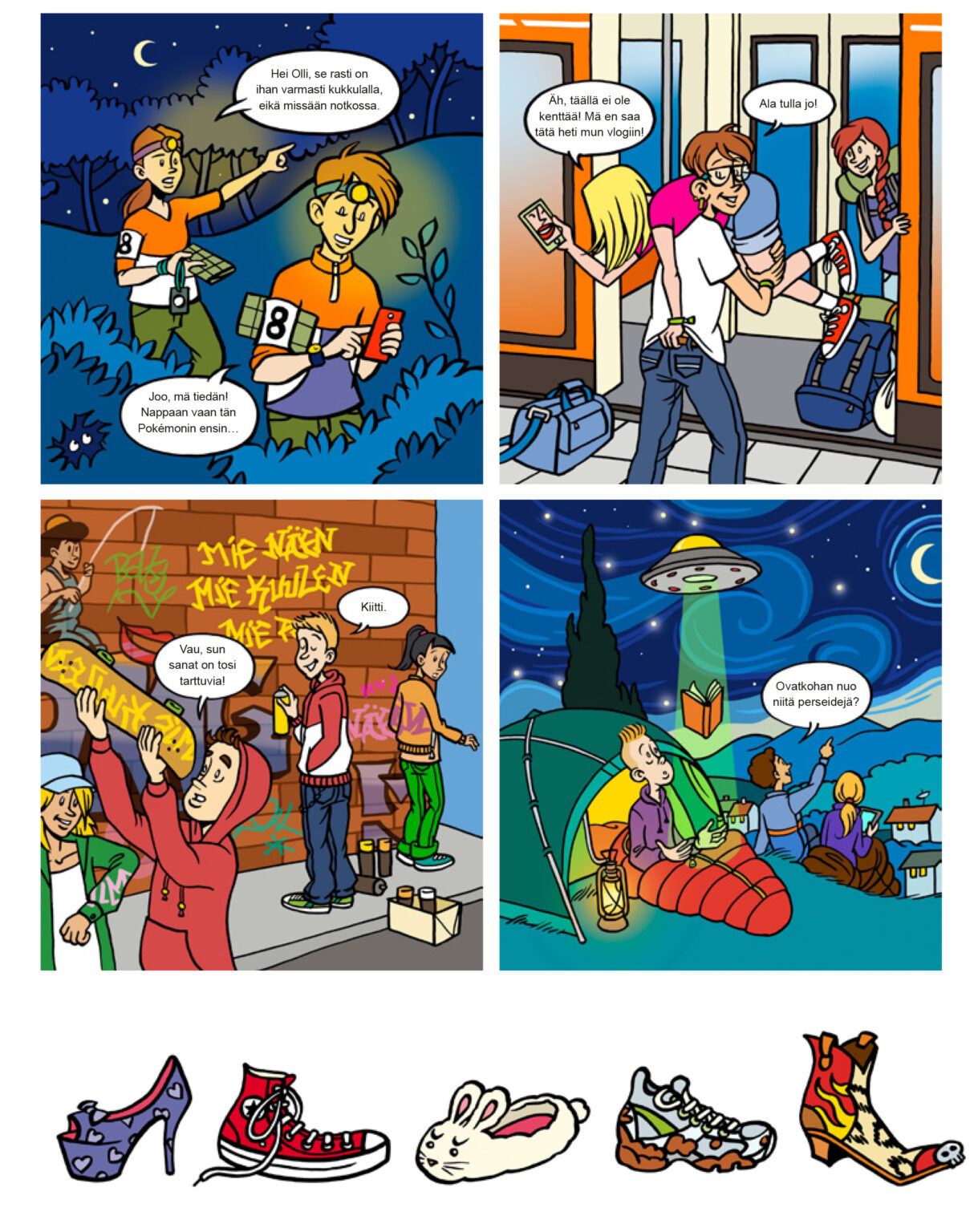
Kärki textbooks 8 and 9 / Sanoma Pro
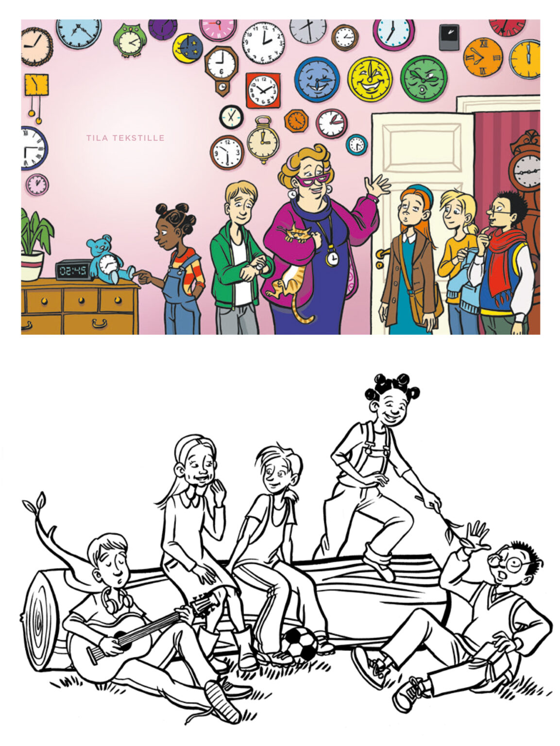
2015–2016. A series of textbooks on Finnish language and literature for 8-9 graders. The exercise books in the series feature an illustration on the opening page of each chapter, which relates to the artwork shown in the opening of the corresponding section of the textbook. Creating these illustrations has been my most enjoyable textbook illustration project, as I was able to combine storytelling with comic illustration and my knowledge of art history in a fun and rewarding way.
Kärki textbooks 8 and 9 / Sanoma Pro
Click to see more about the project.
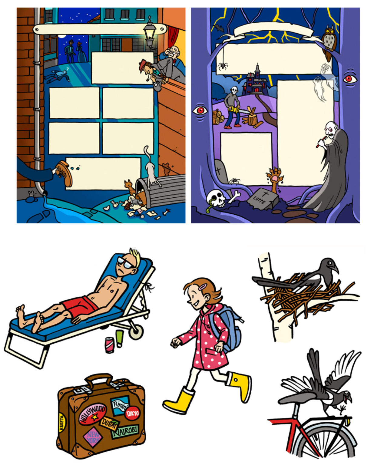
Kärki textbooks 8 and 9 / Sanoma Pro
2015–2016. The images at the top are full-page illustrations. The one on the left is about detective fiction and the one on the right is about horror, with the empty boxes reserved for the title and the body text. The vignettes on the right are part of a series of eight illustrations in which the same magpie adventures in different places.
Kärki textbooks 8 and 9 / Sanoma Pro
Click to see more about the project.
Competition entry / Otava
2012. The works in the Otava textbook illustration competition have been created in the same style and technique as the illustrations in the Salt&Pepper textbook. The illustrations on top were designed for a primary school English textbook. It was from this illustration that the style I used in Salt&Pepper began to evolve.
Competition entry / Otava
Click to see more about the project.
Nuovo Venti (2023)
I designed the Nuovo Venti concert poster in early summer 2023, using a frame that combines historical instrument drawings I’ve processed in Photoshop, photographs of the musicians performing at the concert and my own digital drawing. The frame is inspired by asymmetrical ”baroque beads”, which intertwine with the more symmetrical beads of the Renaissance period to form a frame that references the Baroque and Renaissance music heard at the concert. The concert featured vocal music from the 1500s to 1600s and the fusion of the two, so we wanted the poster with the client to convey this idea.
As the illustrator, I decided to try something completely new. The concert poster is one example of my work where graphic design combined with minimalist illustration creates a cohesive design.
Nuovo Venti (2023)
Click to see more about the project.